Primary bedrooms often look decorated instead of designed because people focus on pretty things instead of how the space actually works. You notice the throw pillows, the art, maybe a nice lamp, and still something feels off. The room looks staged rather than settled. What actually makes a space feel thought-through are the small, consistent decisions: where lighting lands, how bedding layers sit, how storage disappears. Those choices working together is what gives a room its calm, pulled-together quality.
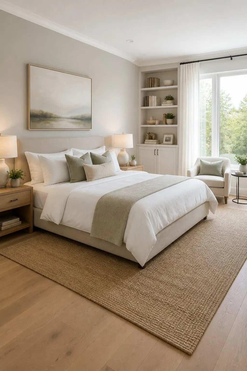
Bold choices that answer practical needs make the room feel designed, not fussy. When you arrange elements with purpose, a clear focal point, layered light, and coherent textures, you get a bedroom that works for real life and still looks measured and intentional.
1) Layered Neutral Bedding: Linen Duvet Over Cotton Percale
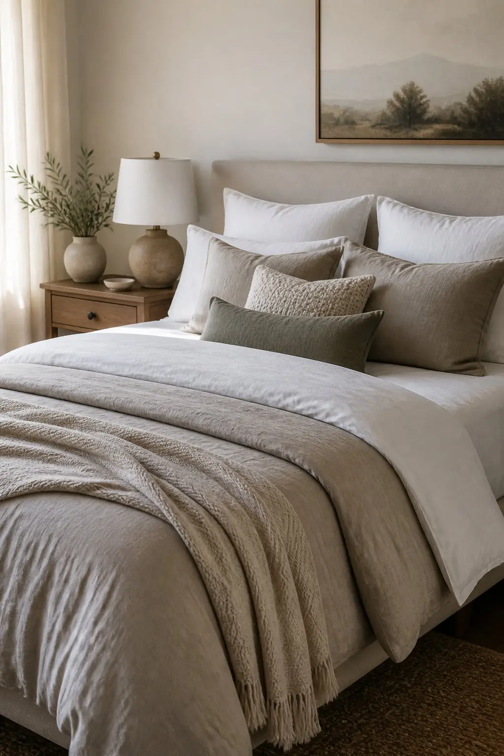
Choose a soft linen duvet over crisp cotton percale sheets so the bed reads intentional, not fussy. The linen adds texture and a lived-in quality while the percale keeps sleep cool and smooth underneath.
Layer a thin blanket or light quilt at the foot, then add two pillow types: plump sleeping pillows plus shallower Euro or decorative pillows for depth without clutter. Place the heavier layer nearest the foot so the bedding looks arranged rather than piled. Stick to a narrow neutral palette of warm white, stone, or soft taupe. That keeps the focus on texture and fit, and lets you mix natural fibers without competing colors pulling the eye in different directions.
2) Paint a Built-In Headboard and Shelving Into the Wall
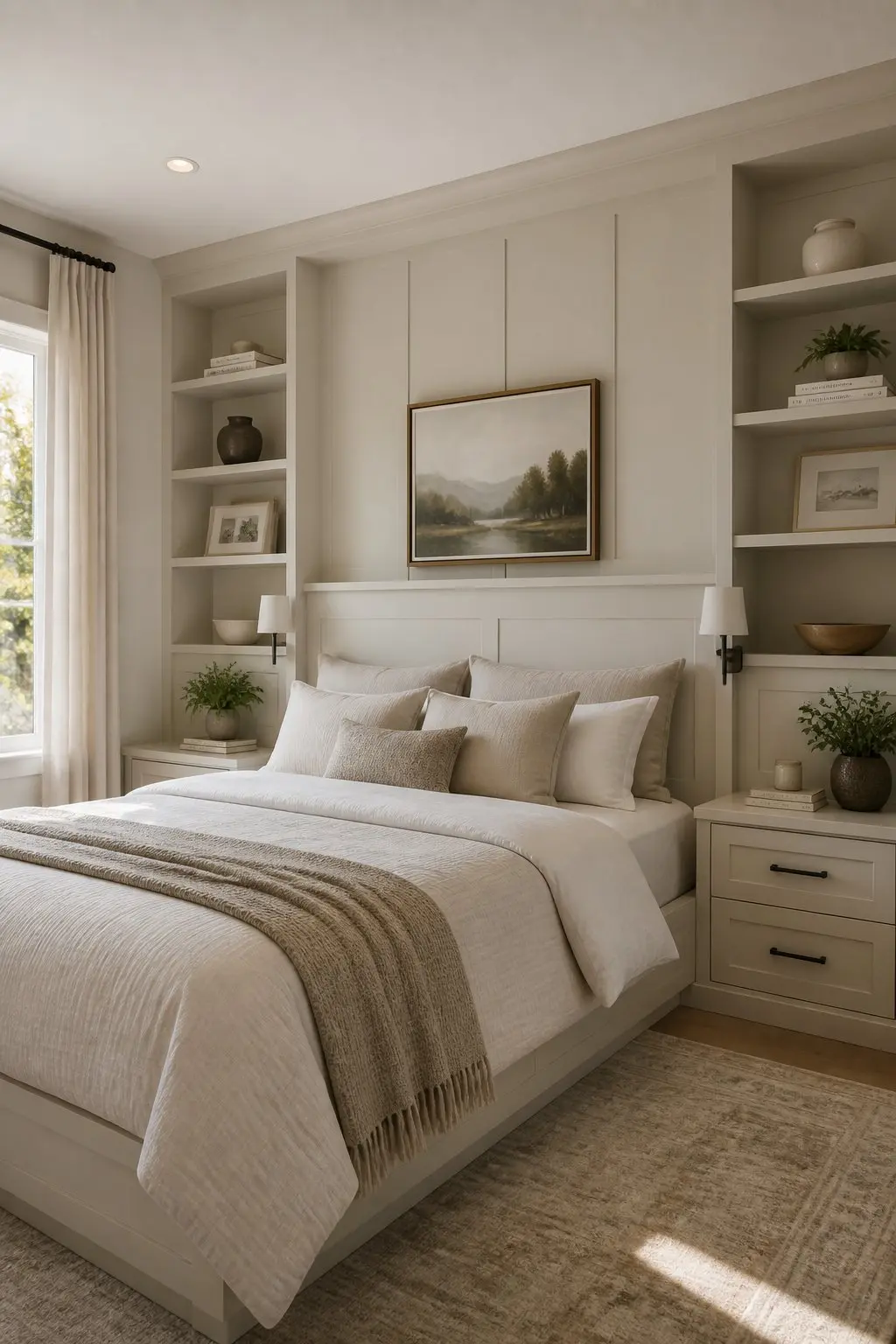
A painted-in headboard and shelves make the bed feel like the room was planned, not assembled piece by piece. By painting the back panel and shelves the same soft color as the walls, you remove visual edges and create a calm, continuous backdrop.
Place narrow shelving on either side of the headboard at eye level so items read as part of the architecture. Paint the inside of the shelves slightly darker or glossier than the wall to suggest depth without high contrast. Keep trim simple and square, and fit the unit to the mattress width for a tailored look. This approach works alongside your existing nightstands and lamps, so you don't need to replace everything to get that custom feel.
3) Same Tables, Different Lamps
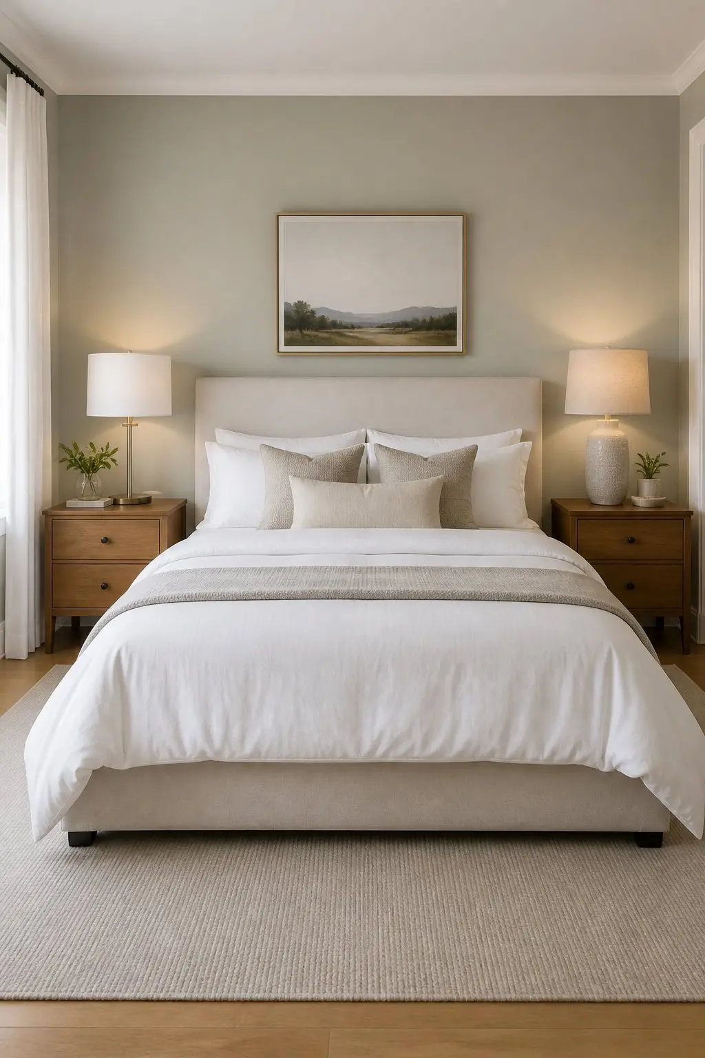
Match the bedside tables and let the lamps do the work of adding personality. Symmetry gives the room a planned, restful rhythm. Two different lamps within that symmetry adds character without disorder.Match the bedside tables and let the lamps do the work of adding personality.
Place the taller lamp on the side with the reading chair, or wherever you want a brighter pool of light. Choose a shorter, softer lamp across from it so the eye rests on both without feeling pulled. Keep tabletop items minimal - a book, a small tray - so the lamp pairing stays the focal point. That setup makes the whole bed wall feel intentional and genuinely easy to live with.
4) Three-Zone Lighting: Overhead, Task, and Ambient Dimmers
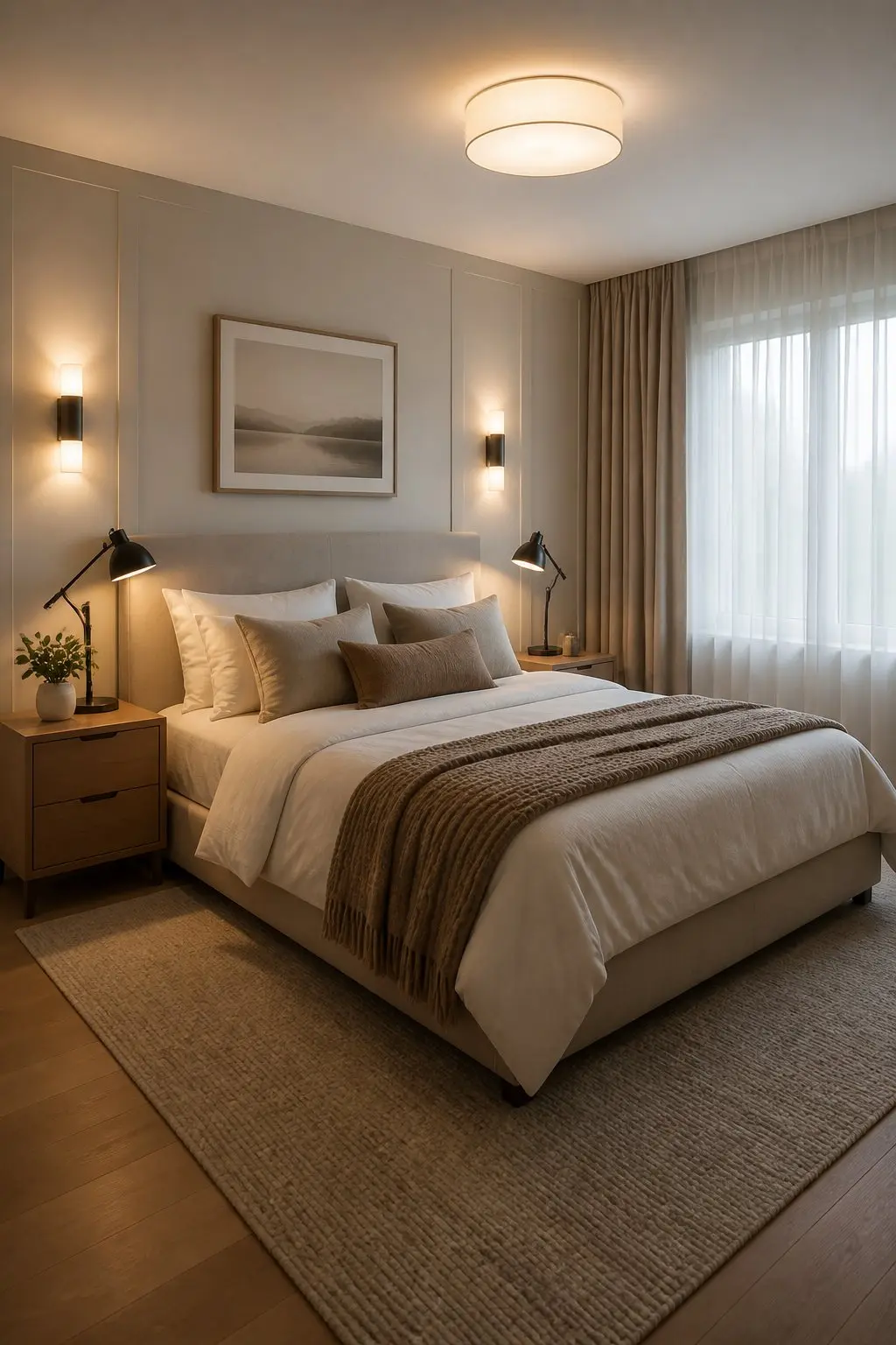
Think of lighting as layers, not fixtures. You get an even, settled look when you combine a main overhead, task lights beside the bed, and dimmers on the ambient sources.
Place the overhead centered over the bed or seating area so it reads as the room's anchor. Add adjustable wall sconces or swing-arm lamps at each side of the bed for reading, aimed low so light falls on your book rather than bouncing off the ceiling. Install dimmers on both overhead and ambient sources so you can move the room from bright and functional to quiet and warm without swapping anything out.
5) Low-Profile Platform Bed to Open Up the Room
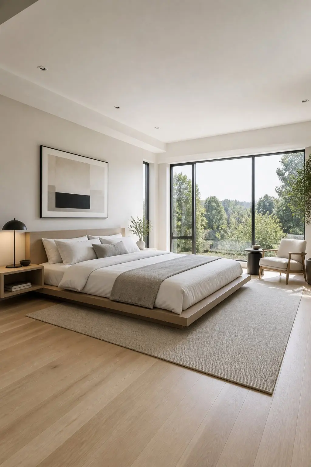
A low-profile platform bed sits close to the floor and keeps lines simple. You'll notice more wall and floor visible around the bed, which makes the layout feel measured and calm rather than full.
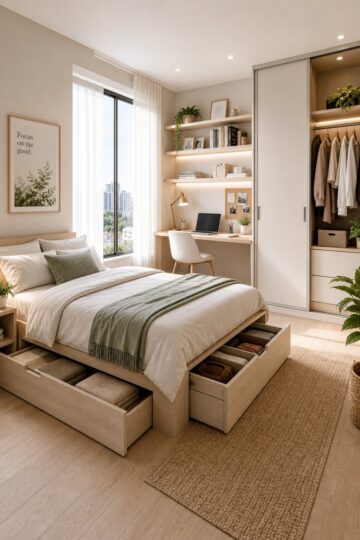
Align the headboard with your largest wall to keep sightlines unbroken and the room feeling wider. Choose a slim headboard or none at all, and let a textured throw or layered pillow carry the personality without crowding the space. If storage is a need, under-bed drawers with a matching low profile maintain the visual effect without sacrificing function.
6) Grasscloth on the Wall Behind the Bed
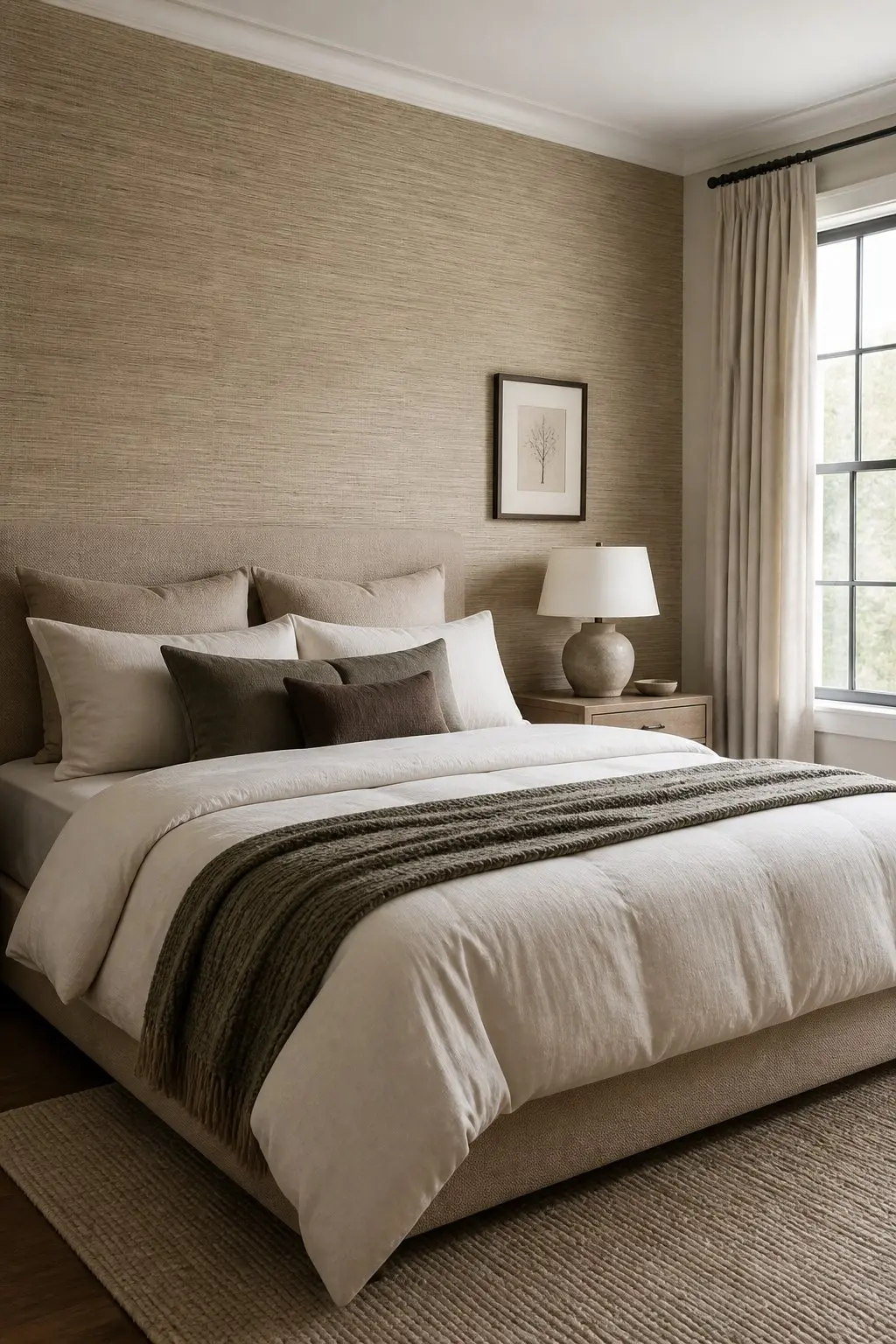
Grasscloth adds real texture that reads like architecture rather than an accessory. The woven, slightly imperfect surface does something paint simply can't: it gives the wall physical depth.
Use it only on the wall behind the bed so it becomes the room's backbone. Keep other walls simple and let the bed sit flush against the paper so the seam and weave show clearly. Choose a neutral tone that complements your bedding and curtain fabrics. In a small room, go lighter and let bedside lamps graze the surface so the texture catches gentle shadows without darkening the space.
"The difference between decorated and designed is usually one layer of intention, not one more purchase."
7) Hang Drapery from Just Below the Ceiling
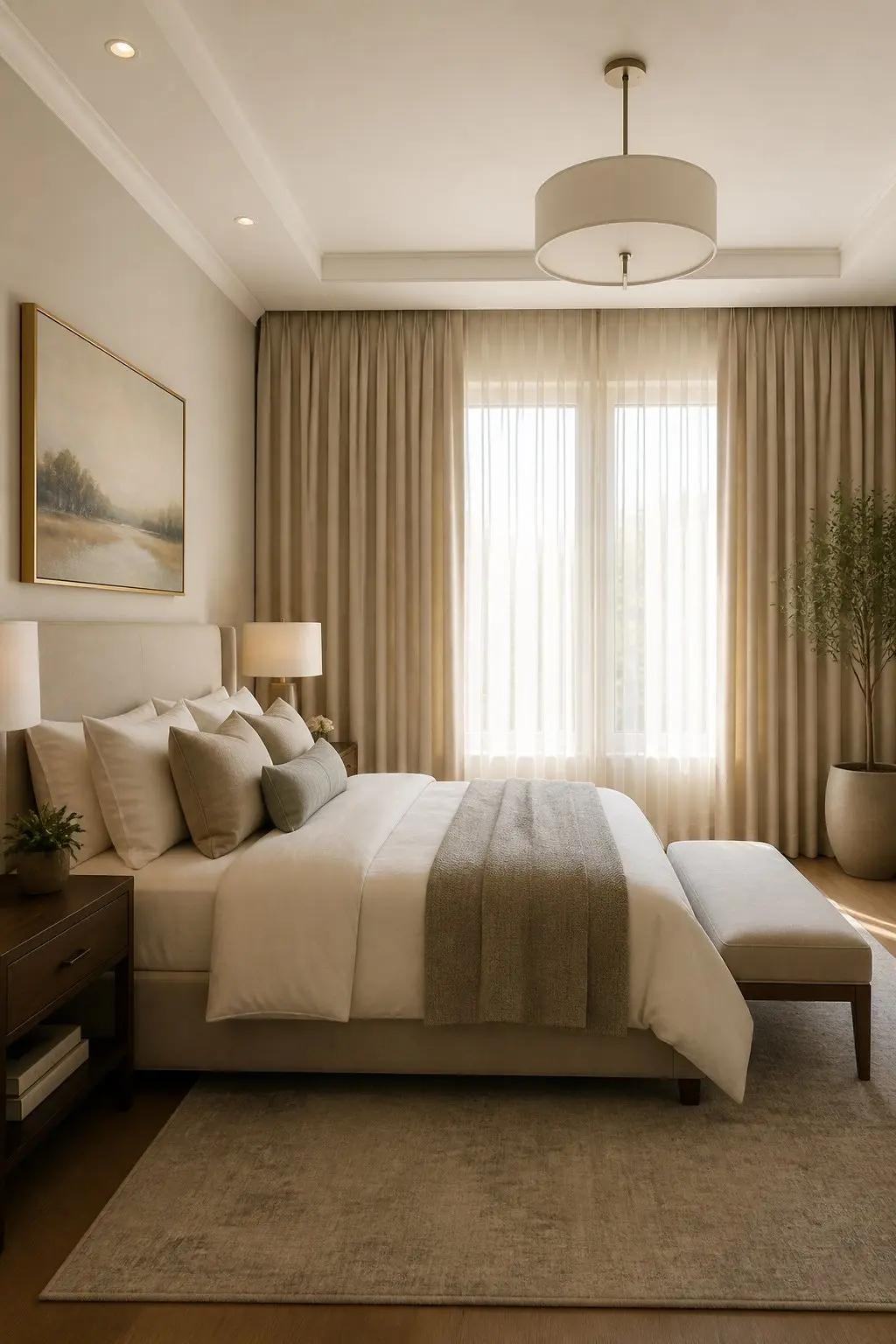
When drapery runs from near the ceiling to the floor, the room reads taller and more intentional. That vertical lift makes the window feel like part of the architecture rather than a framed hole in the wall.
Mount the rod or track one to three inches below the ceiling and extend it wider than the window so the fabric stacks cleanly off the glass when open. Choose full-length panels that brush the floor or puddle slightly for a softer finish. Pick a simple neutral fabric or subtle texture that ties to other materials in the room so the curtains integrate into the scheme rather than sitting on top of it.
8) A Concealed Storage Ottoman at the Foot of the Bed
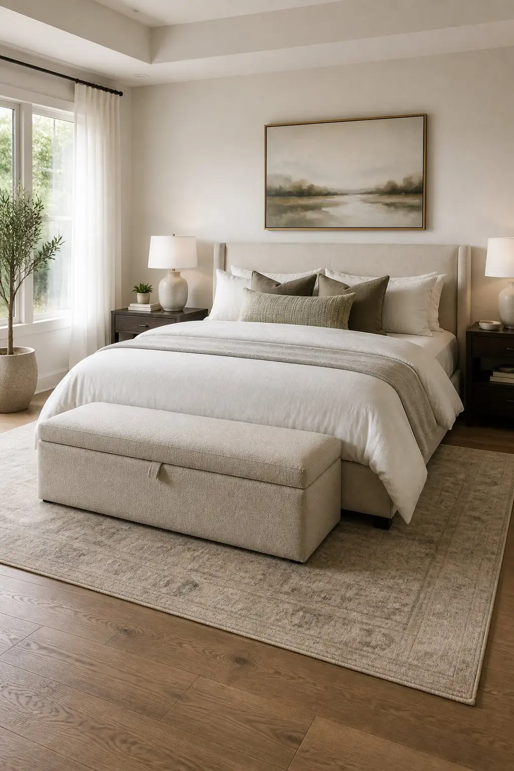
A storage ottoman does two things at once: it gives you a practical place for extra linens or seasonal items, and it gives the room a clean, purposeful anchor at the foot of the bed.
Place it flush with the footboard, same width or slightly narrower, to keep the sightline tidy. Choose a low profile in a neutral fabric that echoes your headboard or rug so it feels like a deliberate part of the room rather than an afterthought. Use the top as a surface for a tray and a couple of books when guests come through, then close it to keep everything else out of sight. That simple habit keeps surfaces calm.
9) Gallery Ledge with Rotated Artwork Instead of One Large Piece
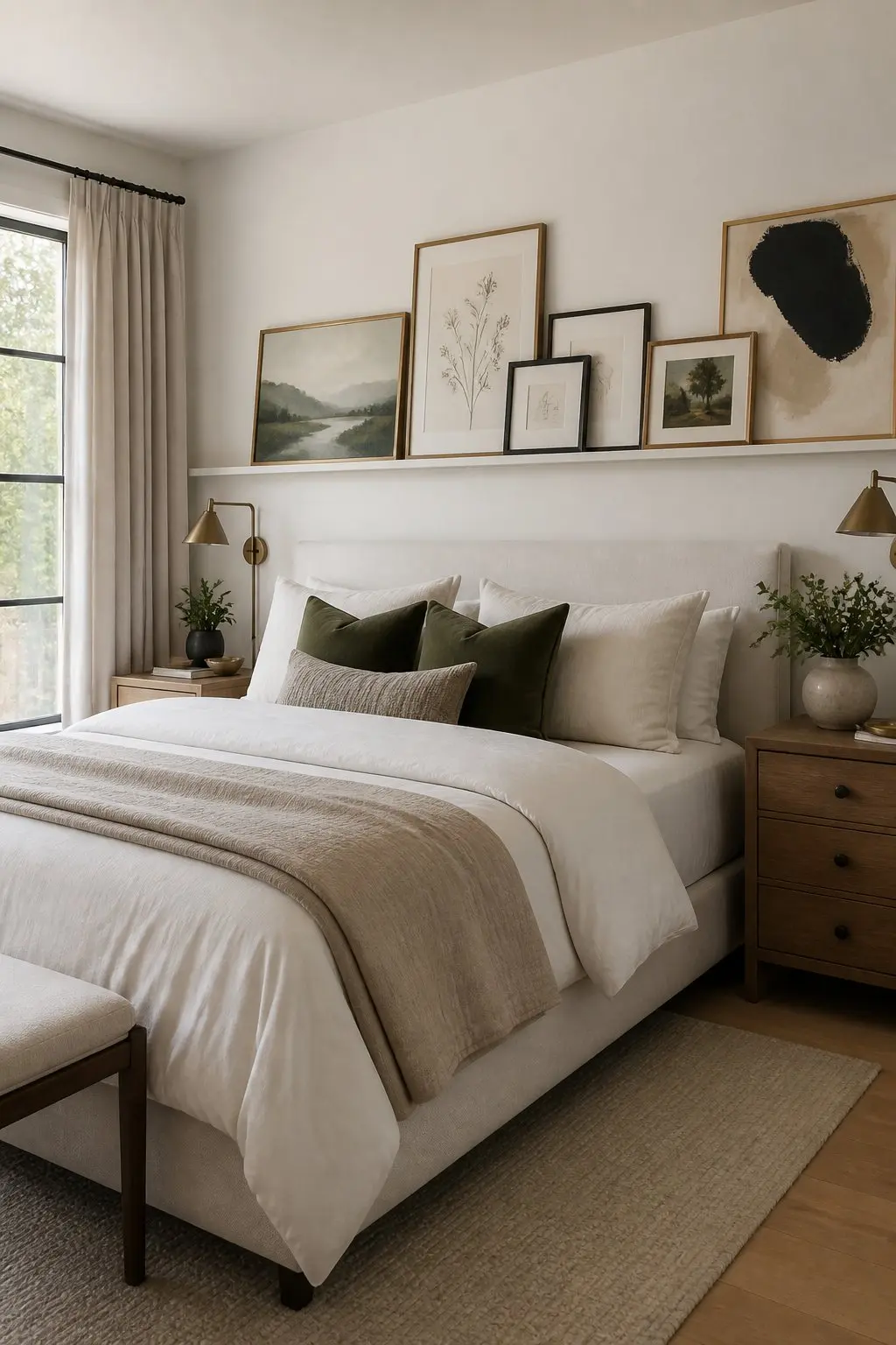
A narrow gallery ledge lets you layer smaller frames so the wall reads as a considered arrangement. The repetition and slight overlap create intention without the pressure of committing to one large piece.
Place the ledge about 8 to 12 inches above the headboard and lean prints at slightly different angles. Rotating one or two pieces makes the arrangement look edited rather than accidental. Mix frame sizes, but keep a limited palette of mat colors and frame tones to unify the group. Swap pieces seasonally or add travel finds so the wall stays interesting without requiring a new focal piece every time.
10) Soft Gray-Green as a Backdrop Color
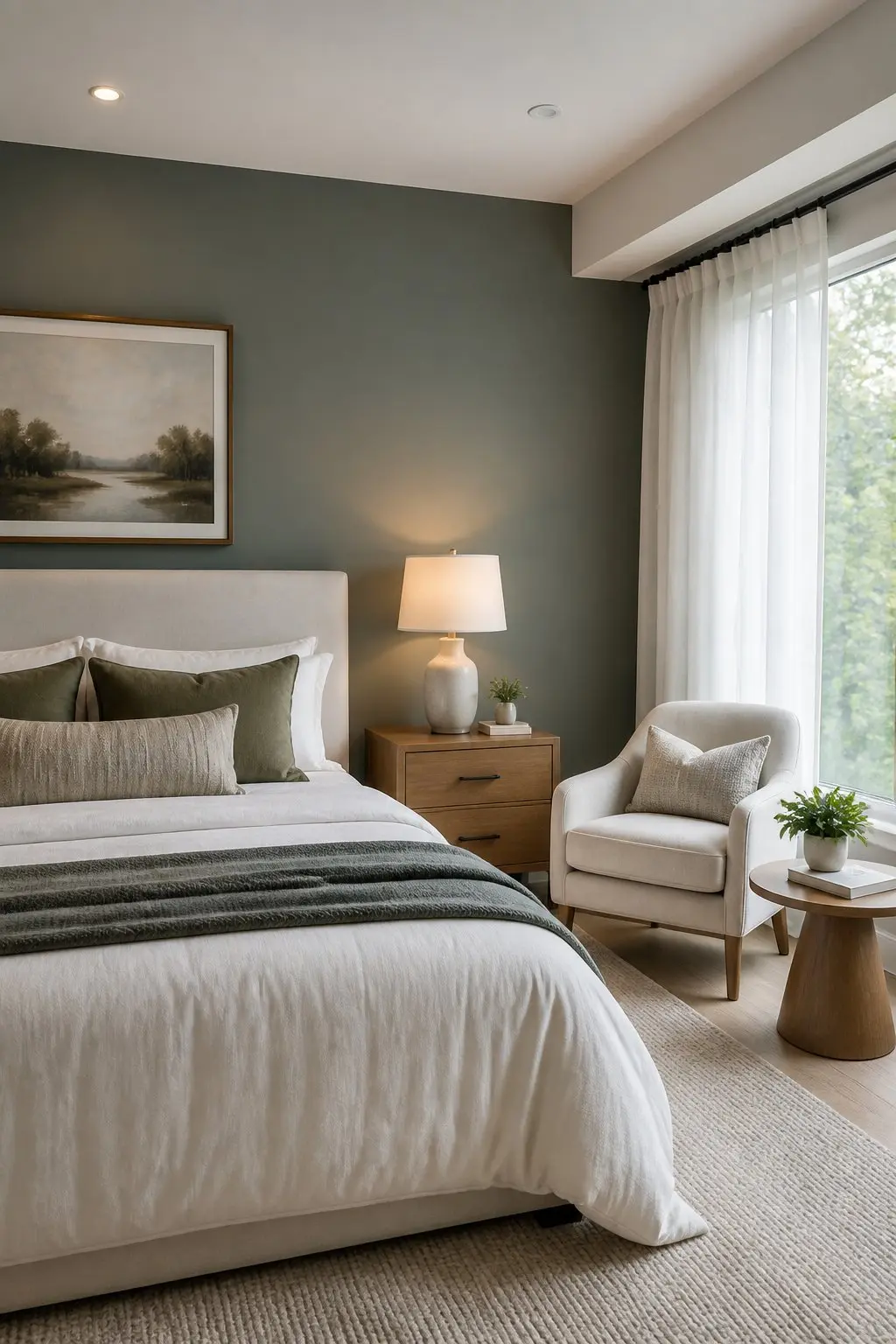
Soft gray-green gives a bedroom a quiet, intentional base. It tames bright whites and warm woods, so other pieces read as planned rather than scattered.
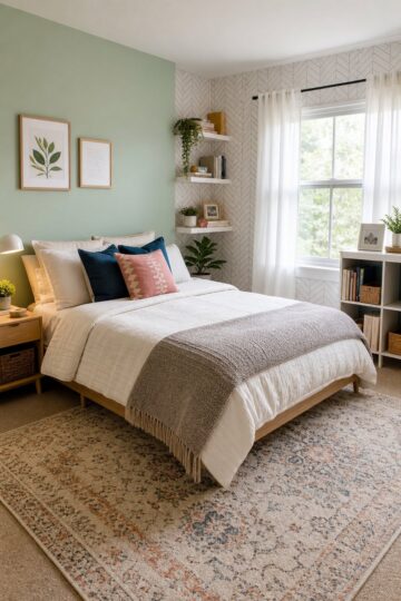
Paint the wall behind the bed to anchor the layout and keep the remaining walls neutral. Your bed becomes the focal point without any new objects. Choose a low-contrast tone so fabrics and art sit comfortably on top of the color rather than competing with it, and test a sample patch near the headboard to check how it reads at different times of day.Did You Know:
11) Matte Black Sconces to Frame the Headboard
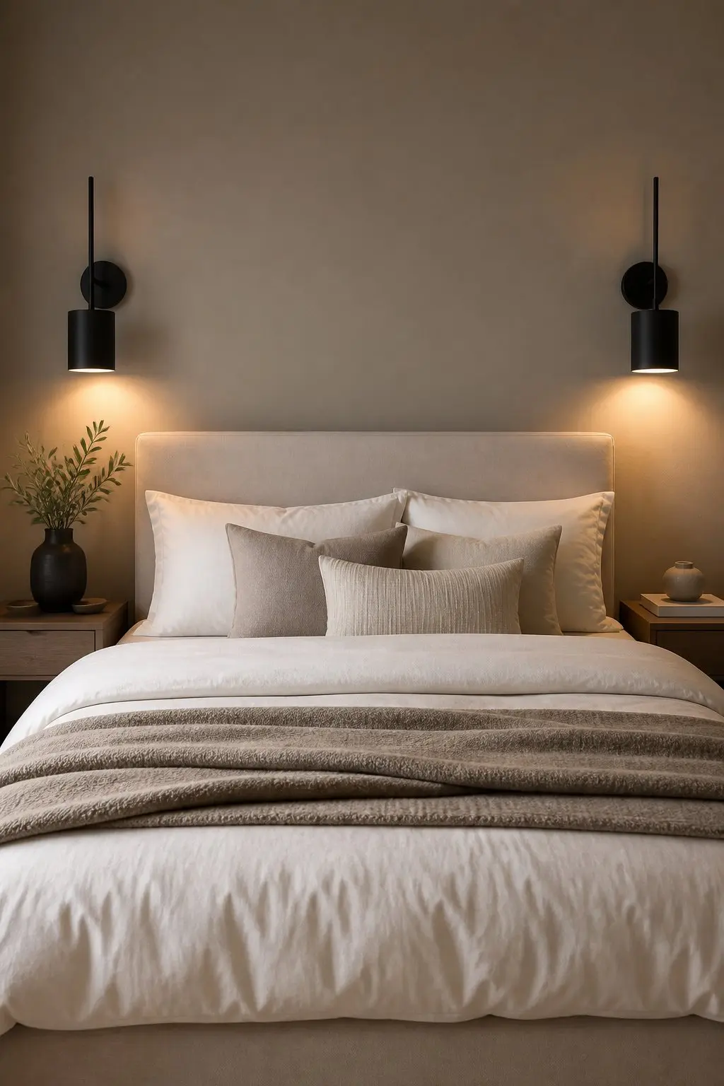
Matte black sconces give you a clean, architectural anchor on either side of the headboard. They make the bed feel deliberately placed rather than just pushed against a wall.
Mount them about 28 to 32 inches above the mattress top so light hits your reading hand, not your eyes. Hardwire them or run a corded version tucked behind the nightstand to avoid visible cables. Choose a simple shape, a cone or cylinder, so the fixture reads like part of the room's structure. The dark finish cuts a crisp silhouette against light paint, helping furniture and textiles read as one coherent plan rather than separate decisions.
12) Velvet Bolsters in a Single Muted Hue
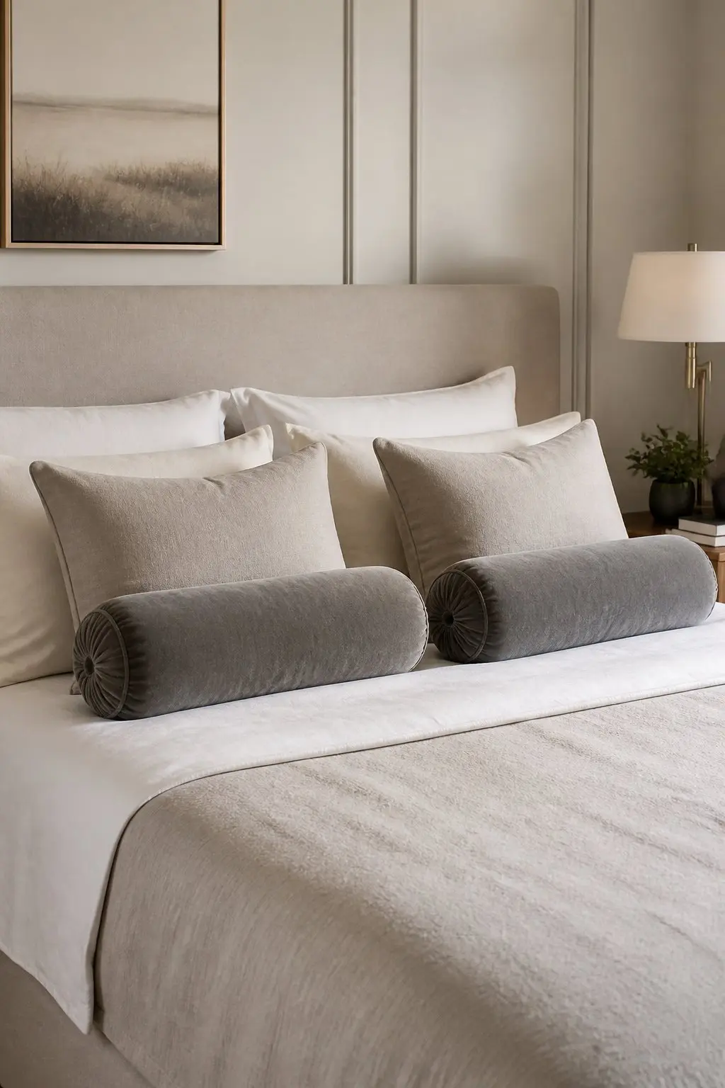
A pair of velvet bolsters in one soft color does more for a bed than a pile of mixed pillows. They give the arrangement a deliberate horizontal line and tactile contrast without adding pattern or visual noise.
Place them in front of your sleeping pillows or along a backrest for a daybed setup. Keep the hue close to other room tones - dusty blue, sage, or warm gray - so they feel like part of the plan rather than an accessory layered on top. Choose a low-sheen velvet with a slightly oversized fill so the bolsters hold their shape. That firmness looks tailored rather than soft and collapsed.
13) Area Rug With 18 to 24 Inches Showing on Each Side
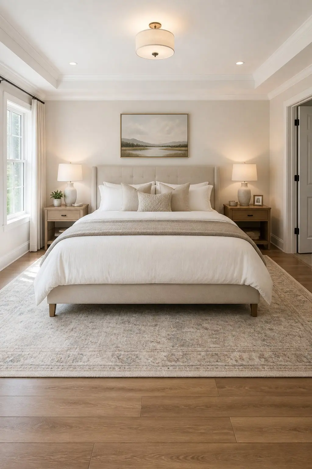
An area rug that peeks 18 to 24 inches beyond the mattress edges makes the bed feel like the room's main piece, not just a place where someone happened to put a rug. That proportion creates a visual frame so the bed reads as grounded and intentional.
Place the rug so its front edge starts under the nightstands or about a third of the way under the bed. That leaves enough rug at the foot and sides for bare feet in the morning and makes furniture placement look deliberate. A typical 8×10 works well for a queen; a 9×12 for a king. The extra border of rug on each side gives the sleeping area breathing room and ties surrounding pieces together without crowding the floor.
14) A Minimalist Dressing Table Done Right
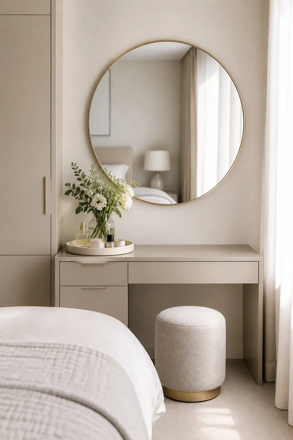
A dressing table kept free of clutter reads as intentional rather than just decorative. Each piece earns its place: a round mirror to soften angles, one lamp for task light, and a small tray for daily items.
Place the table where natural light hits your face in the morning, slightly off-center from a window if needed. Use a shallow brass or ceramic tray to corral your watch, rings, and a lip balm so surfaces stay tidy and the mirror reflects a neat vignette. Keep colors neutral and materials consistent so the whole setup reads as a single composed object rather than a collection of things that ended up in the same corner.
15) Mixing Warm Wood Tones to Avoid the Showroom Look
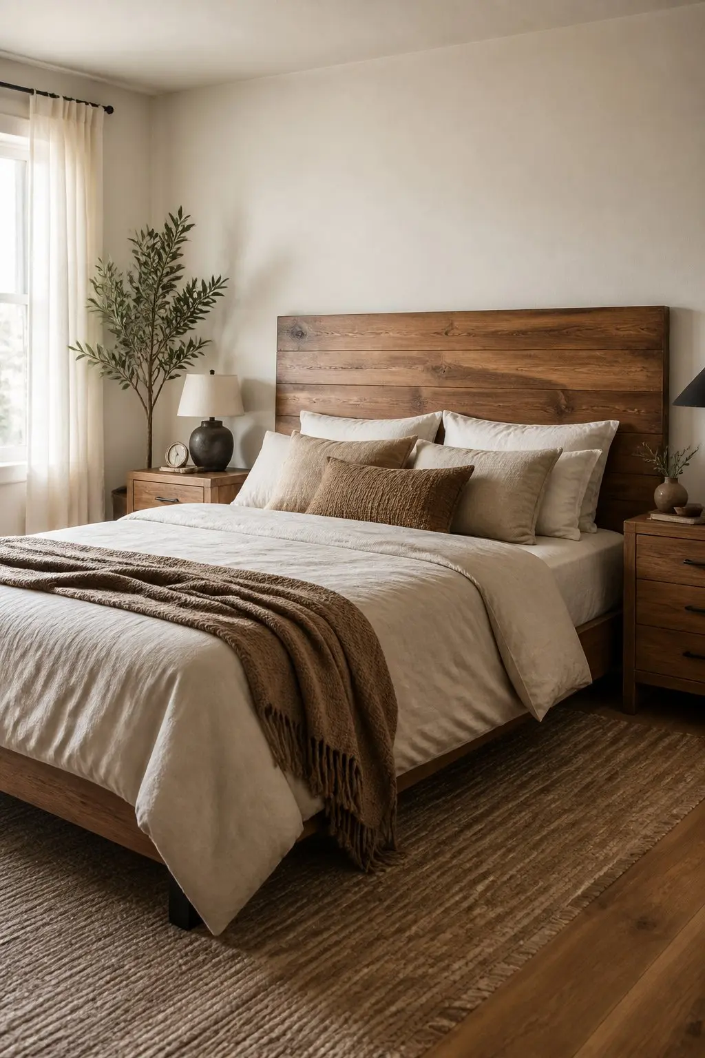
Matching all your wood tones exactly is actually what makes a room feel like a furniture catalog. When you mix a few different finishes - a honey nightstand, a walnut dresser, a rattan bench - the room reads as collected and genuine rather than assembled from a single showroom floor.
Use a mid-tone wood bed as your anchor, then add lighter or darker accents nearby. A pale oak lamp on a darker bedside table, for example, creates contrast that feels natural and easy. Keep the palette to two or three warm woods and tie them together with a neutral fabric. That small restraint makes the variety look intentional and real, rather than random.
16) A Recessed Niche for a Plant or Ceramic Object
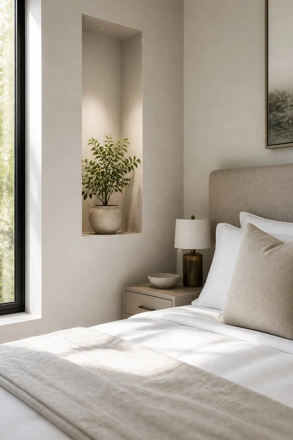
A shallow recessed niche turns a single object into a deliberate moment. It reads as part of the room's architecture, so whatever you place inside looks chosen rather than set down.
Position the niche at eye level beside the bed so a plant catches light and a ceramic piece shows its silhouette. Paint the interior a slightly darker or warmer tone than the surrounding wall to make the object pop without shouting. That subtle contrast does the framing work, and the result feels like a design detail rather than a shelf with something on it.
17) A Bench With Woven Leather Straps at the Foot of the Bed
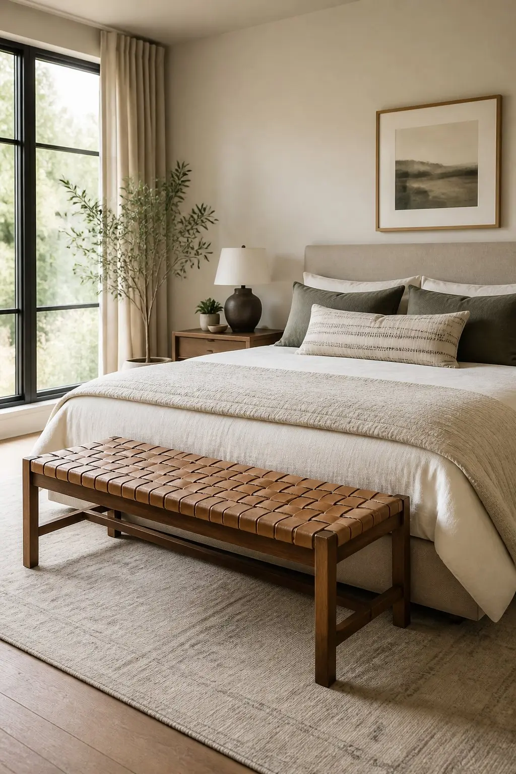
You want seating that looks intentional but still relaxed. A bench with woven leather straps reads like a piece made for living in, not for display.
Place it at the foot of the bed or under a sunny window so the straps catch light and the weave becomes visible. The texture adds warmth and visual interest without needing pillows or throws layered on top. Pick a bench with a hardwood frame and natural leather in a medium tone. That contrast between solid wood and soft, flexible straps anchors the room and feels genuinely considered.
18) Built-In Closet Organizers Sized to What You Actually Own
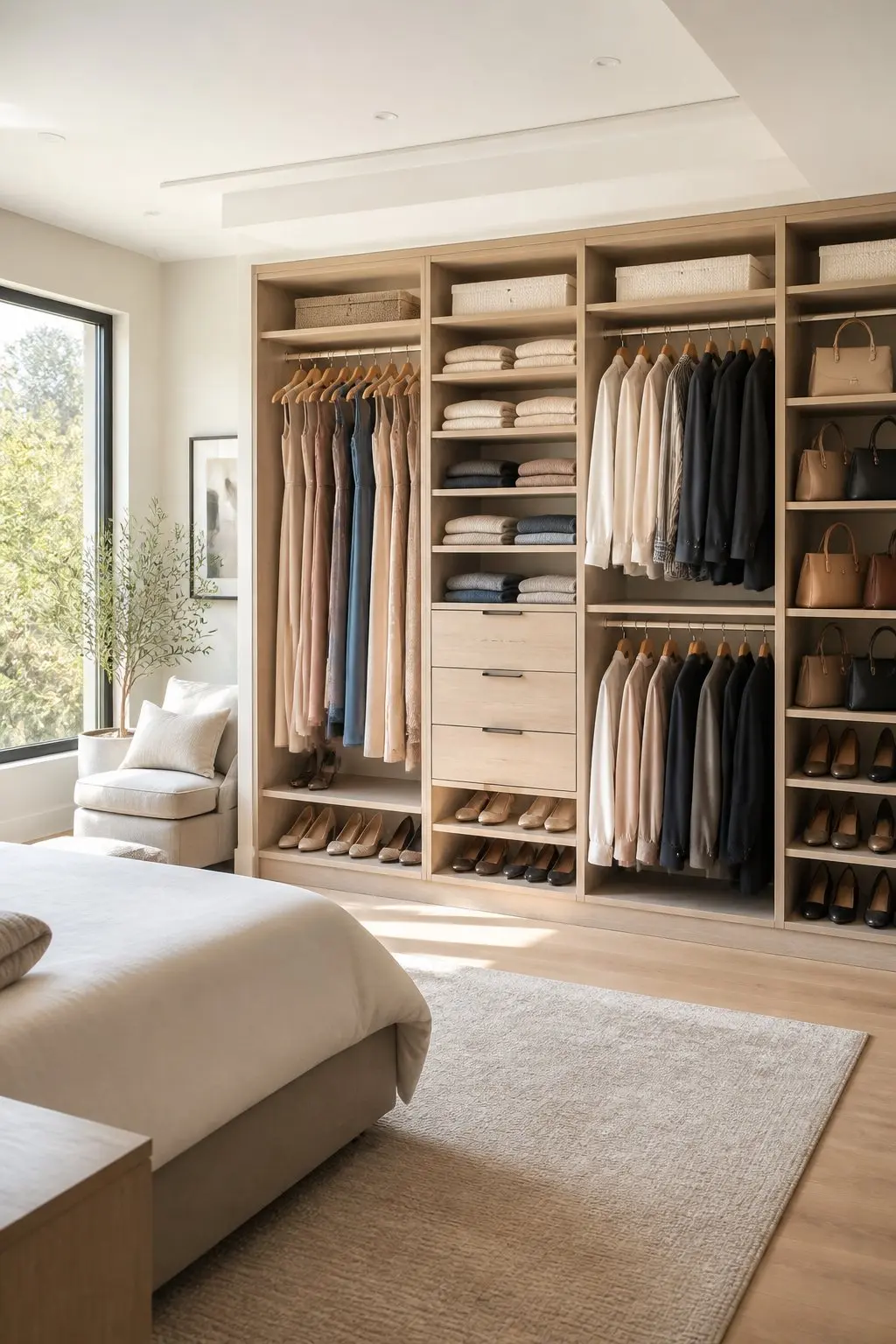
Built-ins make storage feel planned because it is. Shelves sized for actual sweaters, a double rod for shirts, and tall rail space for coats means everything sits where it belongs rather than where it fits.
Think about what you reach for most and set zones accordingly. Daily items at eye level, folded pieces on shallow shelves, longer items on a full-height rail. Install shallow drawers with dividers near the center for smaller things like socks and accessories. If shoes are numerous, a dedicated lower pull-out keeps them visible and accessible without taking up prime hanging space.
19) Blackout Panels and a Sheer Together
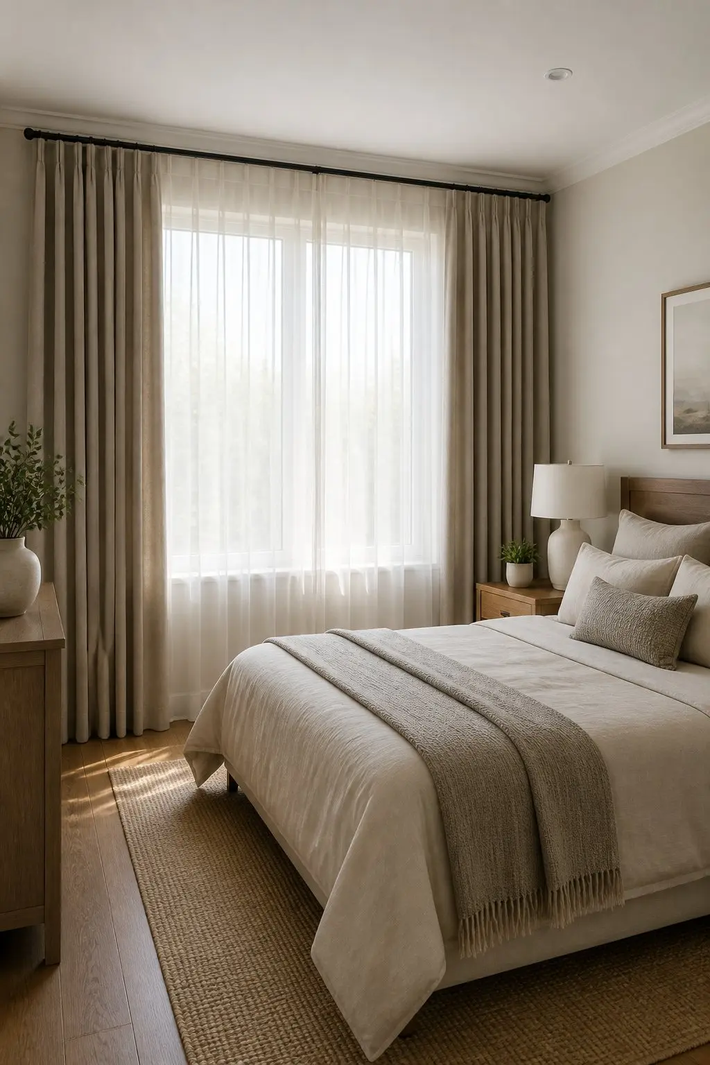
Layered curtains give you control and a finished look at the same time. A blackout panel handles sleep; a sheer handles daylight and privacy. Together, they work like tools, not just window dressing.
Hang the rod high and wide so curtains clear the window when open, keeping light from sneaking around the sides and making the room feel larger. Choose a neutral blackout fabric and a soft, slightly textured sheer so the two read as one composed system. In a small room, lightweight sheers keep the space feeling airy while still offering the privacy you need during the day.
20) A Ceiling Fixture Scaled to the Room
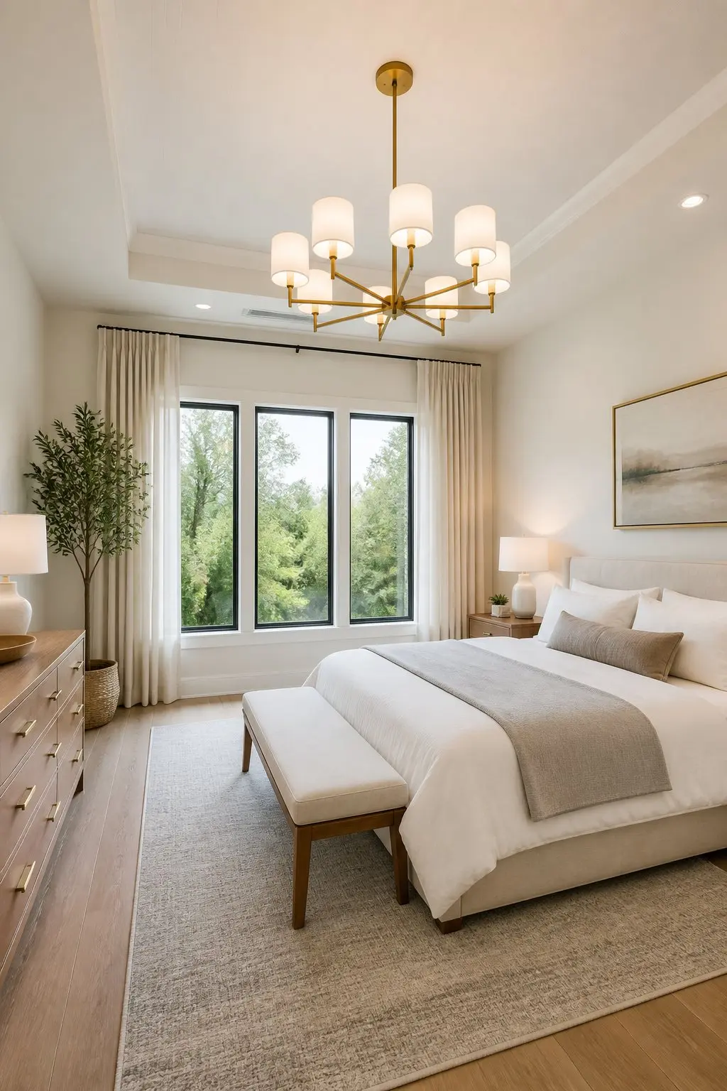
A bold ceiling light anchors the room and signals intention. The key is scale: a fixture sized correctly for the ceiling height and square footage reads like architecture. One that's too small looks like an afterthought.
Hang it over the bed or centered in the room, about 7 to 9 feet above the floor for standard ceilings, slightly higher in taller rooms. If there's a headboard, center the fixture over the bed to create a clear focal axis. Choose a shape and finish that echoes other materials in the room - matte metal for modern pieces, warm brass for classic palettes. That visual repetition ties the fixture into the whole scheme rather than leaving it floating above everything else.
21) A Small Armchair With Lumbar Support Near a Window
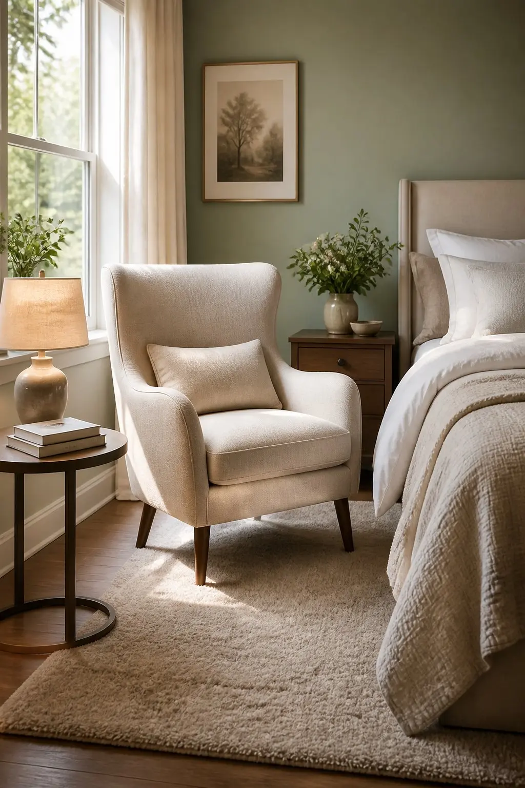
A compact reading chair does something a decorative one can't: it shows the room was planned for actual use. The lumbar detail signals that comfort was considered, not just aesthetics.
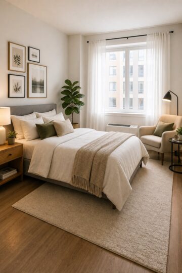
Angle the chair slightly toward the bed or window so it reads as part of the room's layout rather than pushed into a corner. Add a narrow floor lamp behind it for directed light. Keep a slim side table within reach for a cup and a book. Those three pieces together, chair, lamp, table, make it obvious this is a real spot for reading, and that kind of purposeful arrangement is what gives a room its designed quality.
22) Match Wood Trim Tone to Your Furniture
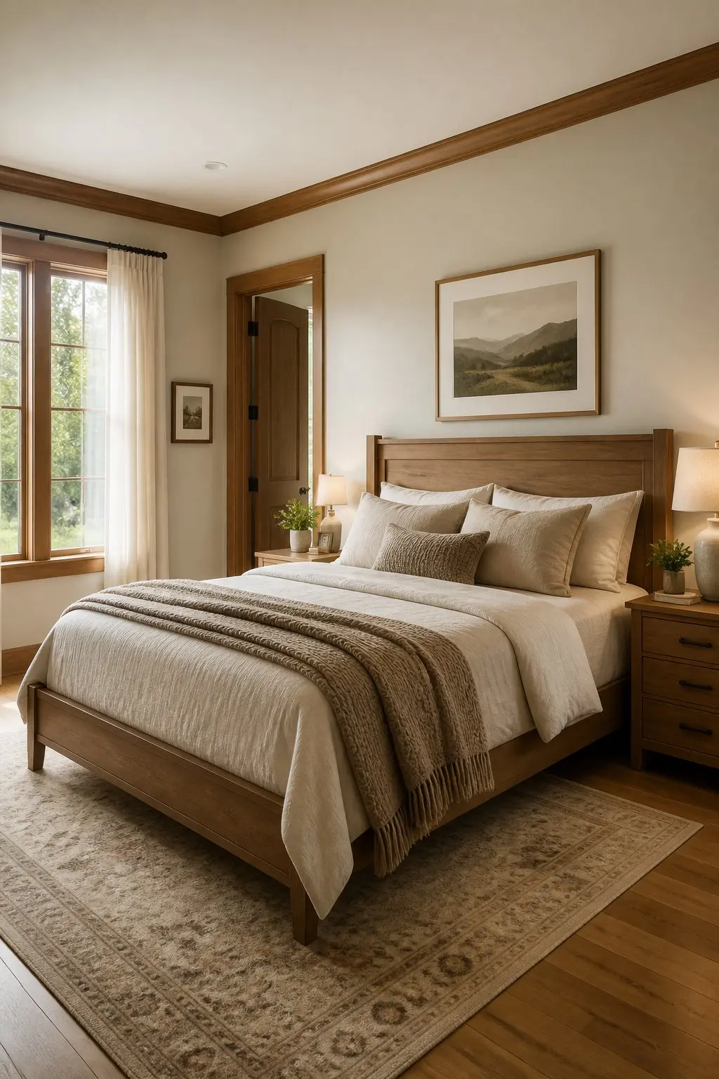
When trim and furniture share a tone or undertone, your eye stops tugging between elements. The room feels like one plan rather than a collection of parts that happened to end up in the same space.
Pick the dominant wood tone in the room - bedframe, dresser, or wardrobe - and echo it in baseboards or window trim. If an exact match isn't possible, aim for the same undertone: warm, cool, or neutral. Paint or stain a sample board and check it against the furniture in different light before committing. Place the matched pieces where they frame focal points: around the bed, by the main window, or along the entry wall. The repeat gives the room a quiet visual rhythm that reads as designed.
23) One Sculptural Object on a Monochrome Nightstand
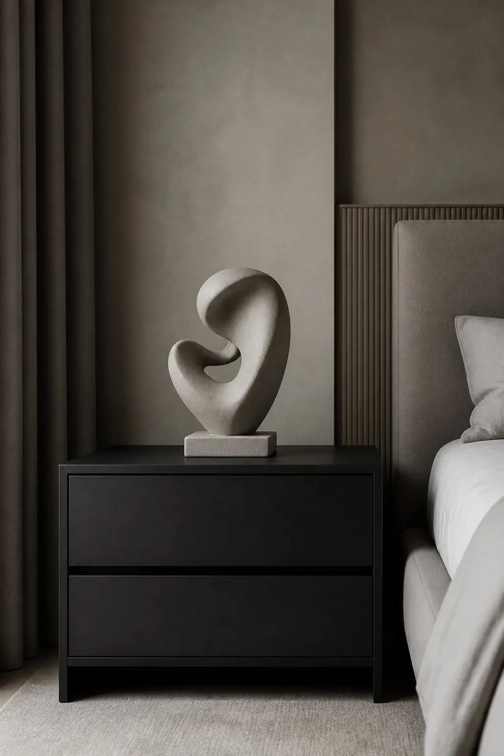
Pick one material or color and stay with it across the whole nightstand. A single sculptural object - a ceramic form, a small stone piece, a curved lamp with a clean base - makes the surface feel intentional rather than assembled.
Place the object off-center toward the back so it reads as a designed focal point. Let the negative space around it show. That emptiness makes the shape and finish more visible, not less. Keep other items minimal: one book or a slim tray in the same tone. That quiet restraint makes the whole bedside look considered without requiring any changes to the larger room around it.
Pro Tip
Negative space on a nightstand works the same way white space works in graphic design - it makes everything else more readable. If a surface feels cluttered, removing one item usually does more than rearranging five of them.
Flow and Focal Points: How the Room Moves
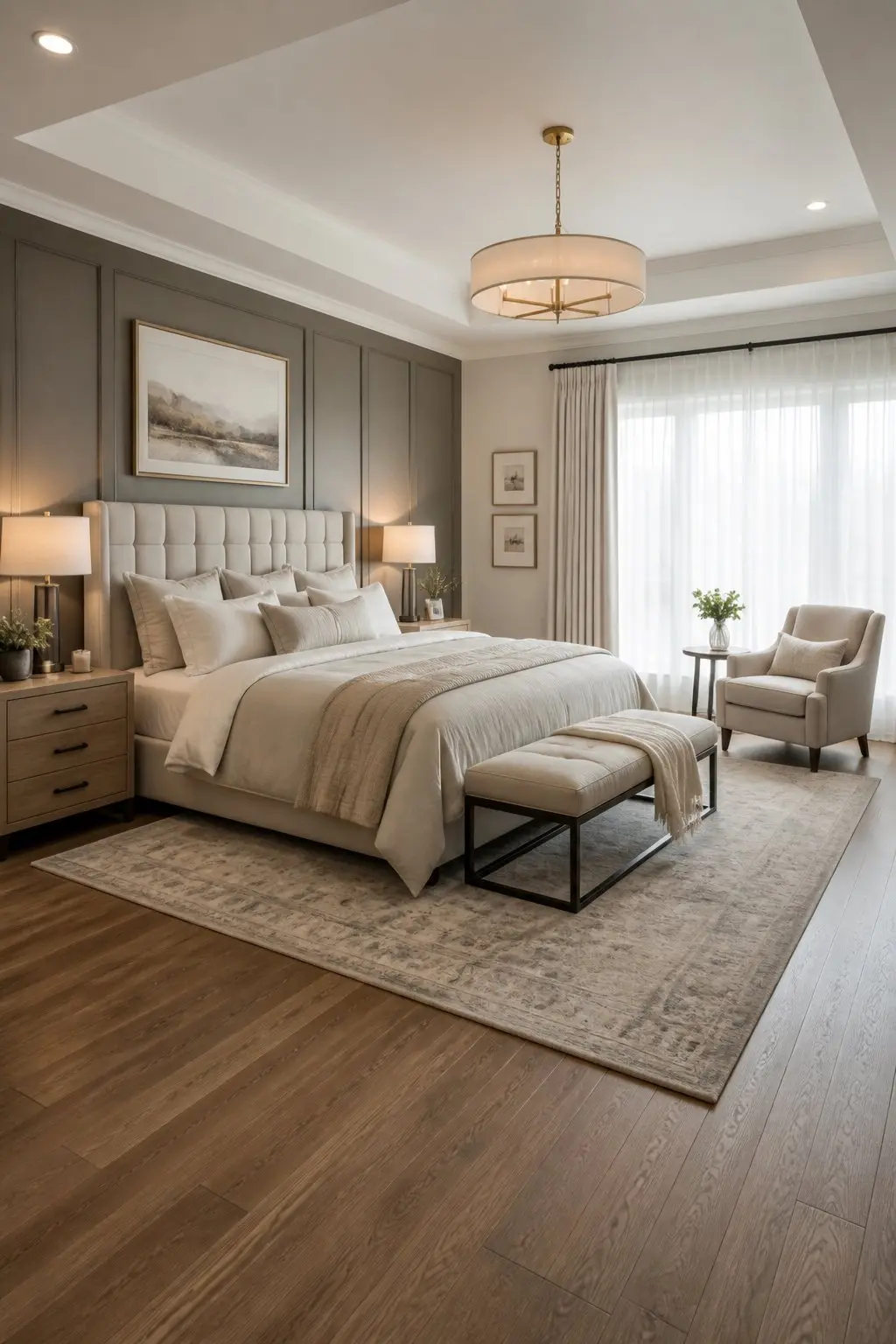
Good flow is less about furniture style and more about clear sightlines and enough space to move. When the room is easy to walk through, it reads as intentional from the doorway before you even register the individual pieces.
Balancing Open Space and Comfort
Think about the path from the door to the bed and around it. Leave at least 30 to 36 inches beside walkways so you can move without squeezing past furniture. That spacing keeps the room from feeling congested and lets the eye travel naturally through the space.
Keep seating and storage scaled to the room. A narrow bench at the foot of the bed or a slim dresser against one wall gives function without blocking movement. Place rugs so they anchor key zones - a rug that reaches under the nightstands ties the bed to the floor and defines the sleeping area clearly.
Avoid pushing everything to the walls automatically. Pulling the bed slightly forward, when space allows, creates a small buffer that makes the room feel planned rather than pushed to the edges.
Choosing One Dominant View or Feature
Decide what should stop your eye first. A window with a strong view, an upholstered headboard, a fireplace. Position the bed or seating to face that element so the room reads as oriented, not random.
Make the focal point work with scale and lighting. If the headboard is the star, two matching sconces do more than one centered overhead light. If a window is the focus, keep treatments minimal so the view reads without interruption. Use one strong material or color for that feature: a textured headboard, an art arrangement above the bed, or a deeper paint on the wall behind it. The eye needs a confident place to land.
Visual Cohesion Through Color and Texture
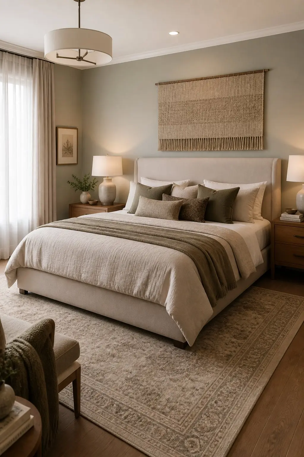
A small palette and a few well-chosen materials do more for a room than a large collection of things in the right colors. Matching tones across large surfaces and repeating textures in deliberate spots guides the eye and calms the space without requiring much.
Layering Neutrals for Depth
Start with two neutral paint tones: one for the walls and one slightly darker for trim or the headboard wall. That creates clear planes so surfaces read as thoughtful rather than flat.
Add textiles in related neutrals - linen drapes, a wool throw at the foot of the bed, a velvet cushion in a close shade. Place the throw over the bench or chair so the texture is visible from the doorway. Include one small contrasting natural material, a raw-wood nightstand or a woven rattan basket, to keep the neutrals from feeling monotone. Repeat that material on both sides of the bed to anchor the composition symmetrically.
Accent Walls and Subtle Color Shifts
Choose an accent wall color that sits one or two steps deeper on the same hue as your main walls. If the room is pale gray, paint the wall behind the bed a muted blue-gray. It reads as intentional and keeps the palette tight.
Keep furniture and bedding in the lighter tone so the accent wall frames the bed rather than competes with it. Mount a headboard or a piece of art that overlaps the painted edge slightly to soften hard borders and make the color feel built in rather than applied. Then use the accent color in one small accessory on the opposite side of the room - a lamp shade or an ottoman - so it registers as deliberate rather than accidental.
A room that feels designed usually has one thing in common: each decision is doing two jobs at once. The rug sizes the space and warms the floor. The sconces light the room and frame the bed. The layered curtains give you privacy and add visual height. When the practical choices are also the aesthetic ones, the room stops looking decorated and starts feeling considered.