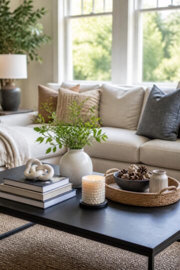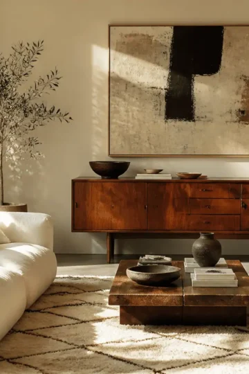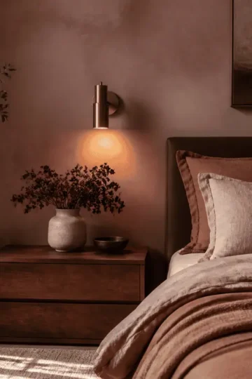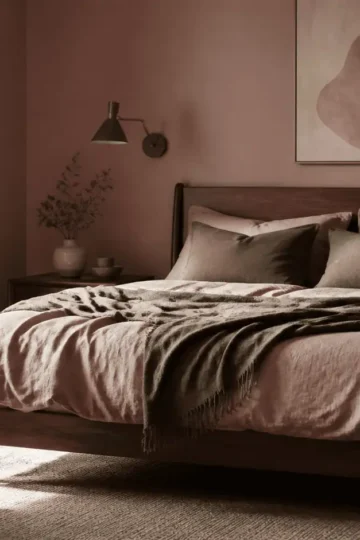
If you look around your living room right now, you probably see a mix of wood furniture you've gathered over the years. Maybe you have a cherry side table you inherited, a walnut media console you bought on sale, and original oak floors. When you put them all in the same room, it can suddenly feel chaotic.
The good news? The era of the matching five-piece living room set is over. Rooms where every piece of wood is exactly the same color tend to look flat, like a furniture showroom rather than a real home. Mixing wood tones gives a space soul, depth, and a collected-over-time feel.
The trick is making those different woods look like they belong together. You don't need to replace everything you own to get a cohesive look. By following a few practical styling rules regarding undertones, contrast, and placement, you can make your mismatched pieces look entirely intentional.
Step 1: Choose Your Dominant Wood Tone
Before you try to balance the room, you need to know what your baseline is. Every room needs a dominant wood tone to act as the anchor.
In most living rooms, the dominant wood is your flooring. If your living room is carpeted, your dominant wood will be the largest piece of wooden furniture in the space-usually a large media center, a massive bookcase, or a prominent coffee table. Once you identify this anchor piece, every other wood tone in the room becomes an "accent" that should be chosen (or styled) to work with it.
Step 2: Identify the Undertones
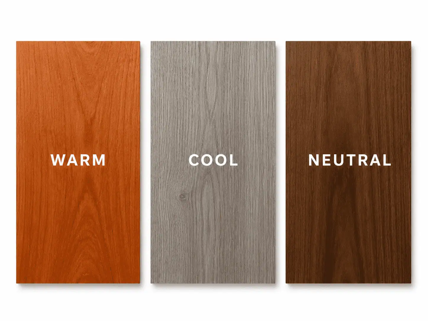
The biggest secret to mixing woods isn't matching the exact color; it's understanding the temperature of the wood. Wood finishes generally fall into three undertone categories:
- Warm Woods: These have yellow, orange, or red undertones. Think cherry, mahogany, hickory, and traditional golden oak.
- Cool Woods: These have gray, ashy, or slightly green undertones. Think weathered oak, driftwood finishes, and gray-washed woods.
- Neutral Woods: These are true browns without strong red or gray leanings. Walnut and some birches fall into this category.
As a general rule, woods with the same undertone temperature play nicely together, even if one is very light and the other is very dark. A light, warm maple will look beautiful next to a deep, warm cherry. However, placing a cool, gray-washed ash table directly on top of warm, orange-toned oak floors will often clash.Styling Tip:
Step 3: Go for High Contrast
One of the most common mistakes in mixing wood tones is trying to get "close enough." If you have a medium-brown oak floor and you buy a medium-brown acacia coffee table that is just one shade off, it looks like a mistake. It looks like you tried to match them and failed.
To make your mix look intentional, you need high contrast. If your dominant wood is light, bring in a very dark accent wood. If your floors are dark espresso, a light white-oak coffee table will pop beautifully against them. The distinct difference in depth tells the eye that the pairing was a deliberate design choice.
Step 4: Distribute the Visual Weight
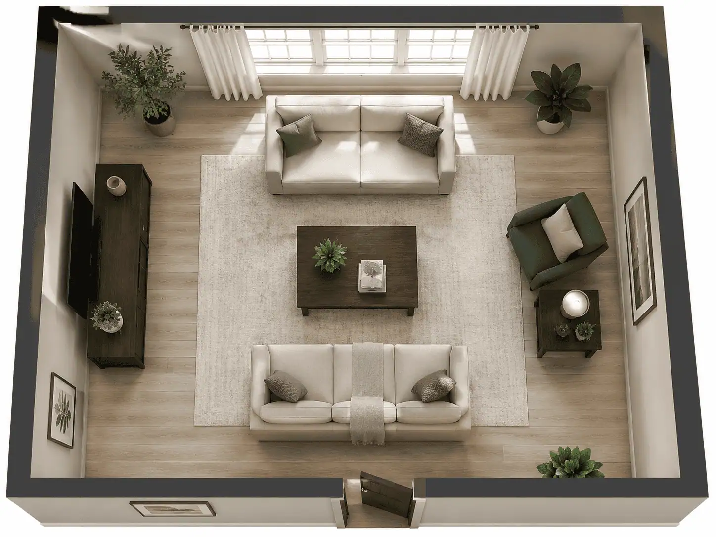
Wood tones carry visual weight. Dark woods feel heavy, while light woods feel airy. If you put your dark walnut console, your dark mahogany side table, and your dark espresso armchair all on the left side of the living room, that side of the room will feel like it's sinking.
To keep the room balanced, you have to scatter your wood tones. If you have a heavy, dark wood piece on one wall, make sure there is a darker wood element on the opposite side of the room to balance it out-even if it's just a dark wooden picture frame, a lamp base, or a small floating shelf.
Step 5: Use "Bridge" Elements to Break It Up
Sometimes, two wood tones just don't look great right next to each other. This often happens with "wood-on-wood crime"-like placing a wooden coffee table directly on a wooden floor. When the transition is too harsh, you need to use bridge elements to soften the visual jump.
- Rugs: A large area rug is the best way to separate a wooden furniture piece from a wooden floor. It creates a visual buffer that allows both woods to exist in the same space without directly competing.
- Painted Furniture: If you have too much wood in the room, break it up with a painted piece. A black, white, or colored accent cabinet gives the eye a rest from wood grain.
- Metals and Glass: Swapping a solid wood coffee table for one with a glass top and a metal frame instantly lightens the room and reduces the number of competing wood grains.
- Textiles: Draping a throw blanket over the arm of a wooden chair or using upholstered ottomans can soften the hard edges of wooden furniture.
Summary Cheat Sheet: Pairing Wood Tones
If you are standing in your living room wondering what to pair with your existing furniture, use this quick-reference guide to find the best accent woods and bridging colors for your space.
| If Your Dominant Wood Is… | Best Accent Woods | Best Bridging Colors (Textiles/Rugs) |
|---|---|---|
| Warm (Cherry, Mahogany, Golden Oak, Pine) | Very light neutrals (Birch, Maple) or very dark neutrals (Espresso, dark Walnut). Avoid cool/gray woods. | Navy blue, sage green, cream, and soft whites. |
| Cool (Weathered Oak, Ash, Gray-washed) | Crisp white painted wood, silvered oak, or dark charcoal/black stained wood. | Warm rust, mustard yellow, soft gray, and slate. |
| Neutral (Walnut, White Oak, Teak) | Almost anything! High-contrast warm woods (Cherry) or very light woods work beautifully. | Terracotta, olive green, slate blue, and charcoal. |
Ultimately, mixing wood tones is about creating balance. By identifying your undertones, embracing contrast, and using rugs and textiles to soften the transitions, you can turn a mismatched collection of furniture into a beautifully curated living room.