If you're in the throes of planning a kitchen refit or redecoration, this is for you. Color trends for kitchens come and go, but green has remained a timeless choice amidst the noise of the other colors that come and go. Because green is the color of nature, it conveys a calm, luxurious feel. Green kitchens can be adapted to meet varying styles, from cottage to Japandi, contemporary, or more traditional. The choice really is up to you.
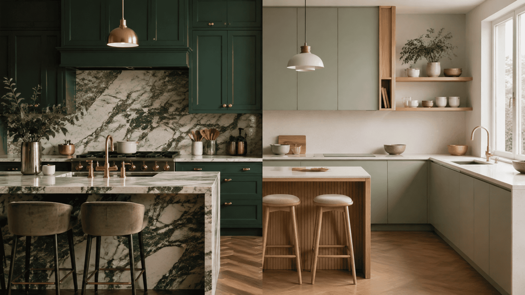
Of course, planning a kitchen is more than just about choosing color. We have to consider other elements beyond the cabinet color, like countertops, hardware, your choice of sink and tap, and even your flooring, all come into play. Let's dive in.
1. Emerald Green + Calacatta Marble + Polished Brass
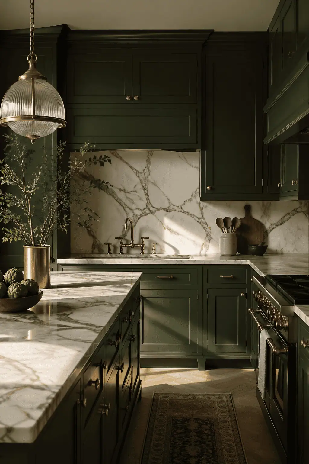
Emerald green with marble and polished brass is my number one favorite combination. So much so, it's the angle I took with my own kitchen fit-out. The vibe gives high-end, but in an understated, quiet way.
The contrast between the deep emerald green and the pale marble works beautifully. Added to that is the veining from Calacatta marble, with its grey and gold organic shapes packing a punch next to the white background. The icing on the cake is polished brass hardware, which can be used as cabinet knobs, pulls, and even for your tap.
A lot of people worry about the longevity of a marble worktop. I did too. However, there are companies now that can protect it so it can be used just as it was intended, without having to worry about staining and etching.
An emerald kitchen with marble is the perfect base for adding your own touches: layered wooden chopping boards to soften the space, trailing plants (I love to use an asparagus plant for its long, flowing silhouette), and thrifted finds to add your own personality.
2. Forest Green + Dark Walnut Accents + Knurled Bronze
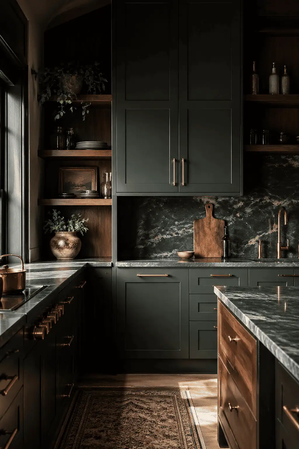
Forest Green, Dark Walnut, and Bronze …. where do I start? What a combination!
Forest Green is a cool-toned paint choice, and using it alongside walnut with its warm undertones ensures a contrasting yet grounded scheme. Walnut is a go-to choice for me because of its open grain, telling a story, and adding depth where it's needed. Adding unlacquered or aged bronze is a ten out of ten.
The patina will improve over time, and those touch points on your knobs and cup handles will only get better with age. Lighten this scheme with quartz or marble worktops, and if you've got a kitchen island, make this a focal point with an oversized vase full of foliage or a pedestal fruit bowl.
3. Hunter Green + Soapstone + Aged Brass Cup Pulls
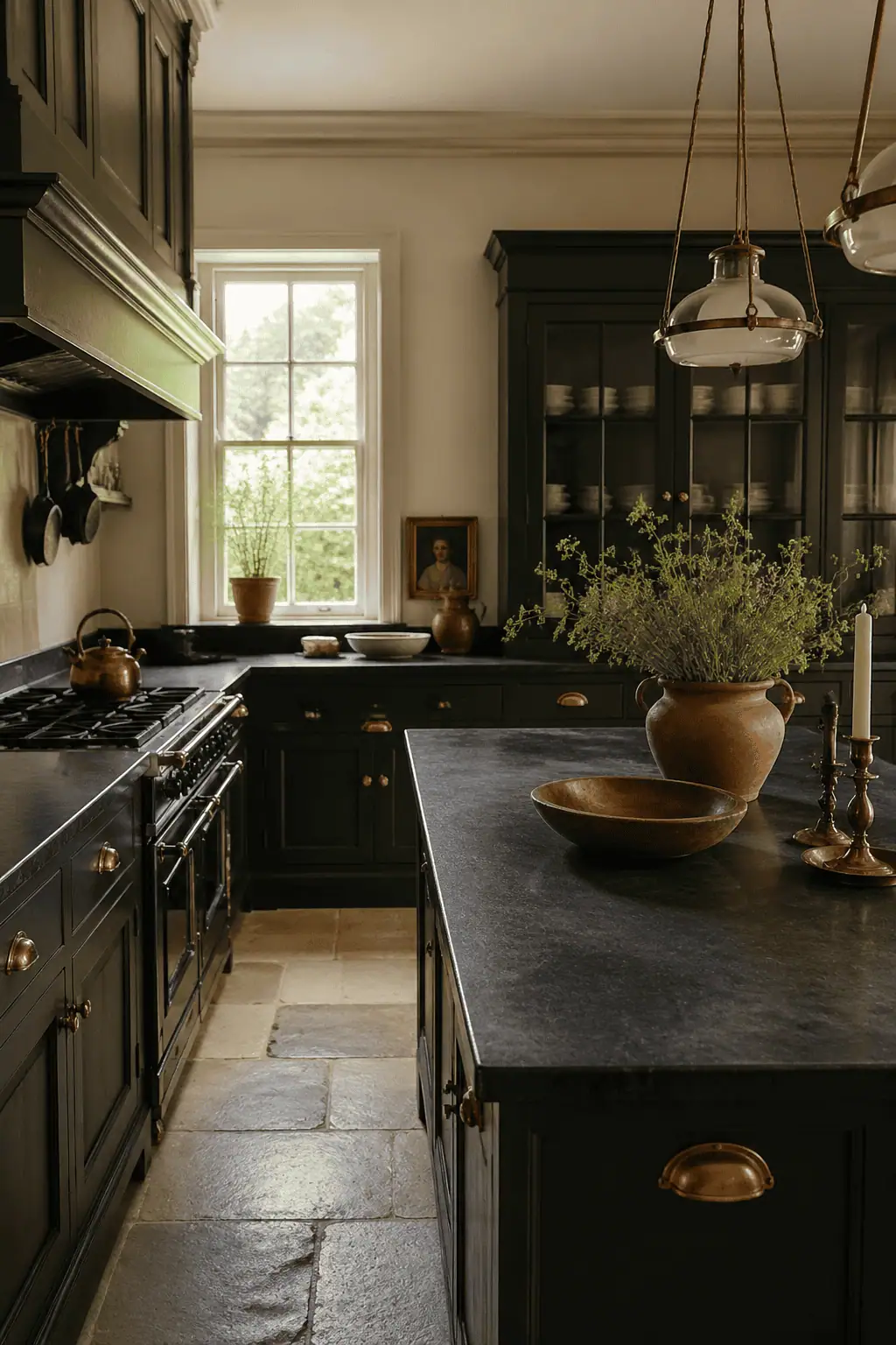
Hunter Green for your kitchen gives nods to the past, particularly the Victorian era. Pairing it with soapstone, which was historically used as a countertop material, works a treat. Alongside that, consider aged or antique brass for your door handles, wall lights, or even a kitchen island pendant.
Because of the history these choices reflect, it's important to choose your doors carefully. Avoid modern slab cabinetry doors and instead choose a more traditional raised panel or shaker style so the overall scheme complements itself.
4. Deep Teal-Green + Zellige Tile + Unlacquered Brass
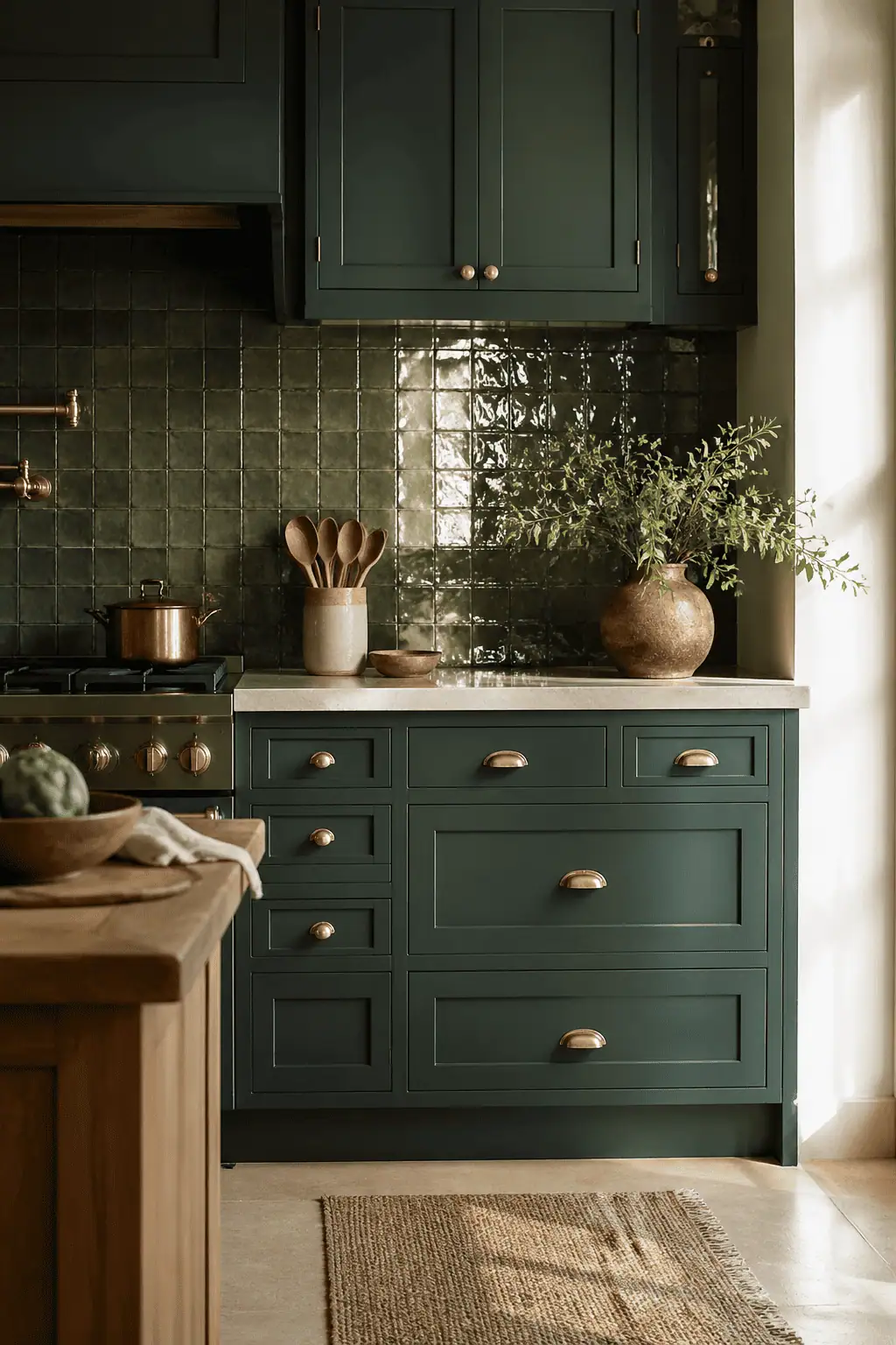
If you want to blur the lines between blue and green in your kitchen, consider teal because it sits right on that blue-green boundary. Pair it with a Moroccan zellige tile, which is made by hand and glazed with an astonishingly beautiful irregular surface that shimmers subtly as the light hits it, creating a wonderful organic look on your backsplashes.
Bear in mind that zellige tile is thicker, so you will need to consider the strength of your wall and plaster if you want to use it on a vertical surface. It will also need protecting, but that's simple enough with a tile protector with a cloth on application and every six months thereafter.
Adding unlacquered brass fixtures and fittings is the icing on the cake. The unlacquered means it has no protective coating, so it patinas beautifully over time, telling the story of your home. It darkens and streaks, which I think is beautiful, but it's not a look that everybody enjoys. If you want your kitchen to remain looking brand new, it wouldn't be the choice for you.
5. Blackened Green + Honed Black Granite + Matte Black Hardware
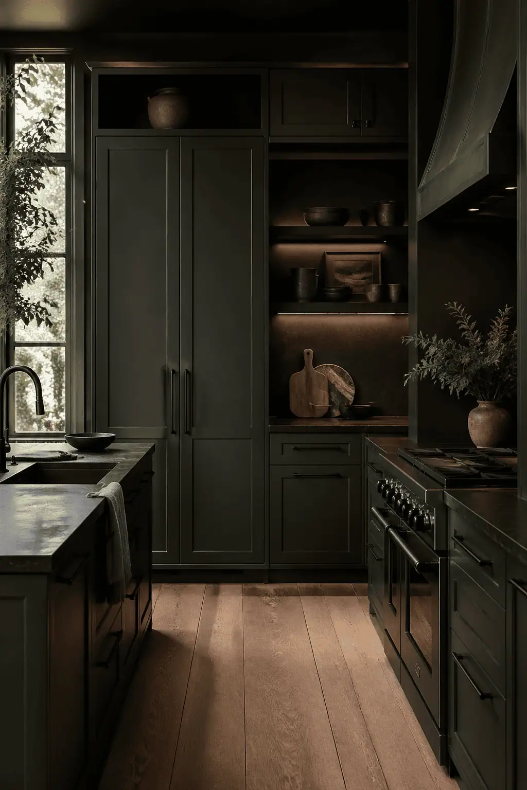
If you want a high-end, moody-looking kitchen, how about considering blackened green with honed black granite and matte black hardware? Have a look at Farrow and Ball Invisible Green. Is it green? Is it black? You tell me! Add honed granite for a tonal look and matte black hardware to finish things off.
With this combination, you're sticking to the same tonal color palette, but the textures vary to add depth and interest. That's an important key: the textures must differ; you'll end up with a flat scheme that feels uninteresting and dull. In this darker scheme, your lighting is essential. You need task, ambient, and accent lighting to make sure things don't feel oppressive.
6. Juniper Green + Brass Mesh Inserts + Creamy Quartz
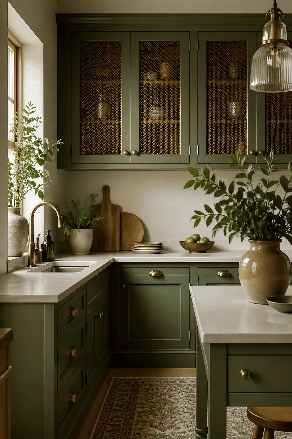
Juniper green is a slightly more muted green, perhaps a good choice if you like to play it safe with your interiors but still want a sophisticated space. Break up the color with brass mesh inserts to replace solid door fronts. This is a technique used historically on larder cupboards and pantries for ventilation, and it gives an English country kitchen look that works well with unfitted or semi-fitted cabinetry and a mix of open and closed storage.
It gives that effortless look of a range of units coming together that somehow work yet don't match. A creamy quartz worktop will make sure the juniper green doesn't feel too cold, and warm brass accents will hold its hand without competing. A lovely mix, timeless and elegant, but as mentioned, on the safer side for those that don't want to commit to stronger colors.
7. Olive Green + Butcher Block + Ceramic Knobs
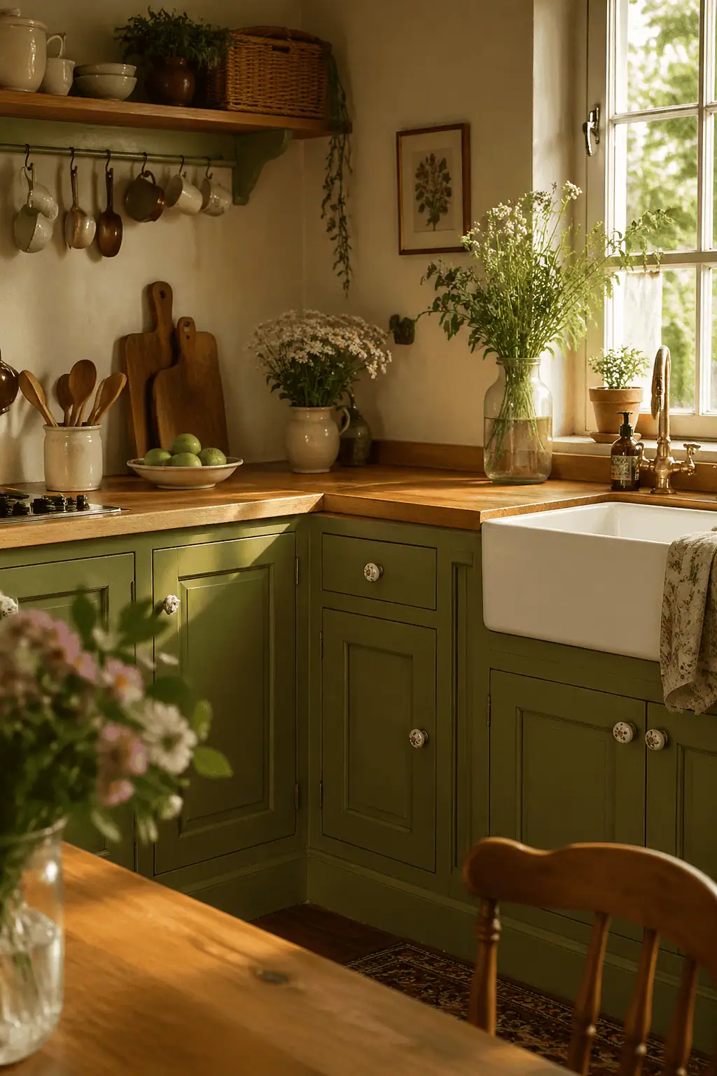
If you're a fan of Farrow and Ball's Dibber or Little Green's Olive Green, why not consider an olive green kitchen and add a butcher block and ceramic knobs for a nostalgic theme, particularly suited for homes in the countryside. The olive green will sit beautifully alongside the butcher block with its natural warmth, and bonus points if your butcher block has an aged patina to tell a story of years gone by.
Ceramic knobs, either matching or collected over time, work well with modern hardware, mixing old and new for that cottagecore appeal. Remember, though, a butcher block will require maintenance with twice-yearly oiling and sealing to make sure the wood stays hygienic.
8. Moss Green + Beadboard Backsplash + Antique Brass
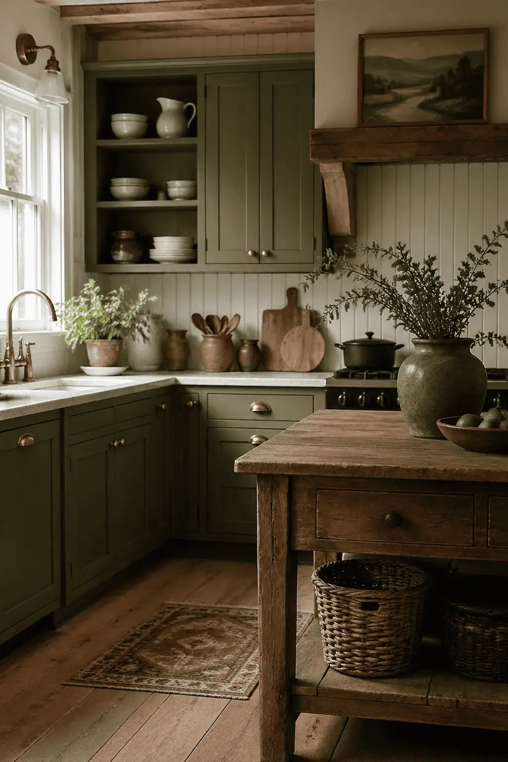
Moss green is a lovely shade for your kitchen, regardless of the orientation. It sits somewhere between sage and olive and feels earthier and somehow more forgiving. Choose beadboard to create vertical paneling for a decorative touch as a backsplash. It works particularly well in rooms with low ceilings because it draws the eye up.
Add antique brass hardware because it sits beautifully against the moss green, working in harmony rather than competing against it. Moss green, warm wood, and antique brass are a cohesive, organic palette. Avoid nickel or chrome because it breaks that warmth. By following these, you'll end up with a timeless kitchen to be admired by everyone who comes to visit.
9. Khaki Green + Tumbled Travertine + Oil-Rubbed Bronze
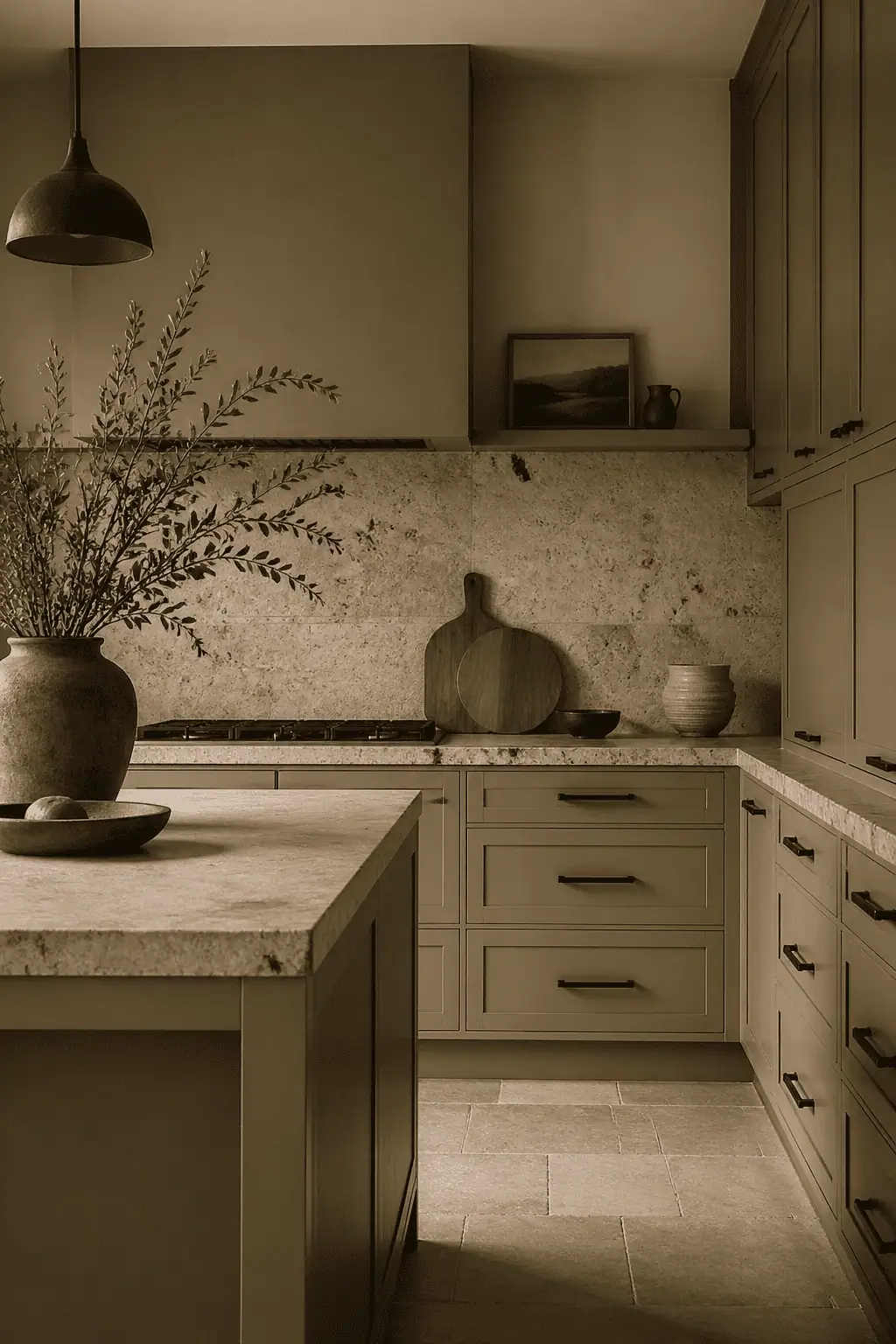
Khaki green, in my opinion, is a wonderful choice, but one of the hardest greens to get right. It can appear quite grey depending on your natural light, so make sure you test heavily before you commit. When it's done right, it looks fantastic and is really on point currently. It gives a lovely organic modern look when paired with travertine worktops with a tumbled edge, and an oil-rubbed bronze with its dark hand-finish patina adds the perfect contrast without feeling too cold.
10. Muted Sage + V-Groove Paneling + Leather Pulls
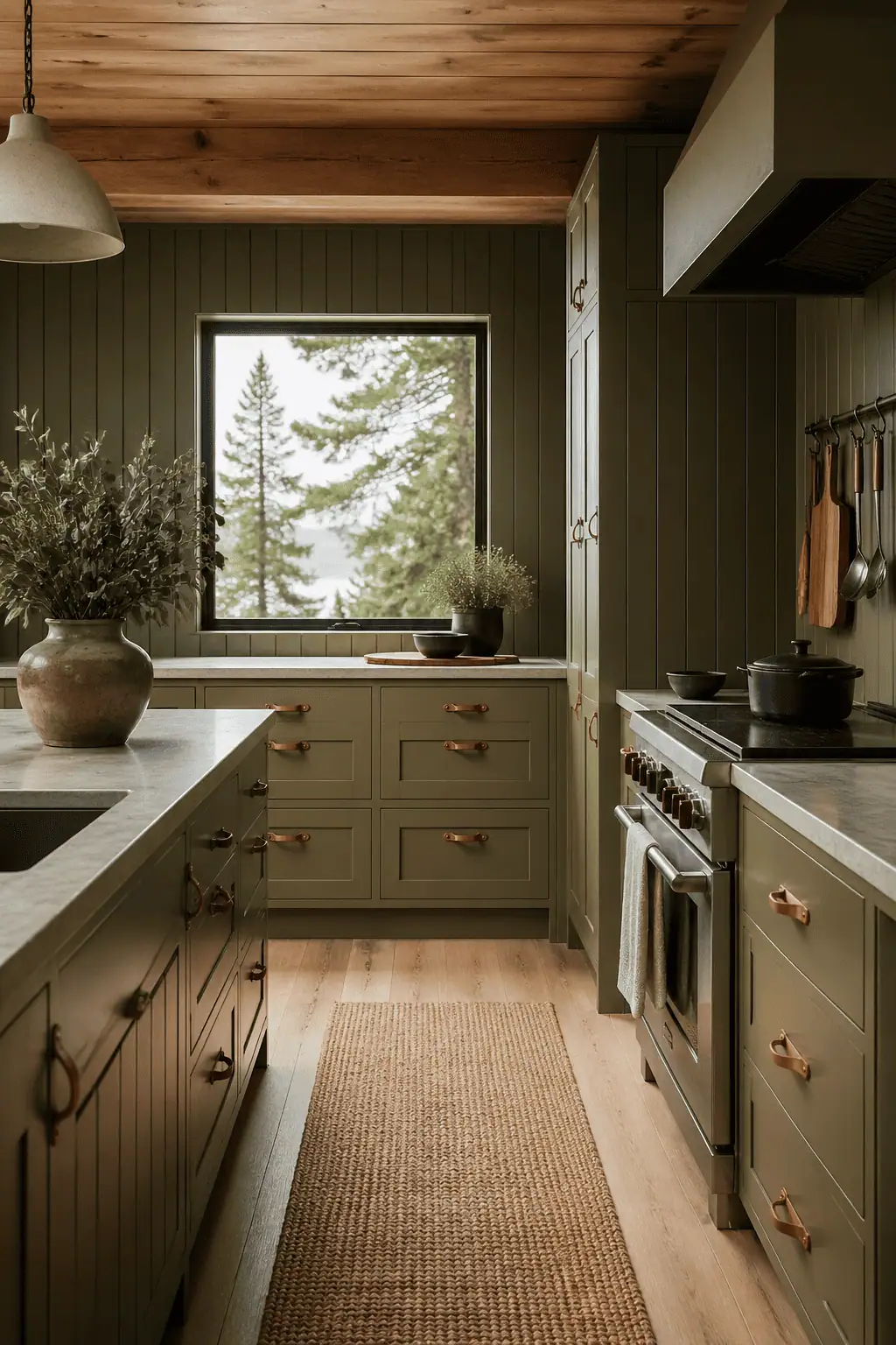
Whenever I talk about a muted sage on my social channels, it always gets a good response, and for good reason. It's soft, it's sophisticated, and it's so easy to live with. The downside, of course, is that it's popular, so it can feel overused.
To counter that and achieve a more distinctive look, consider V-groove paneling, which looks great and creates vertical lines to visually raise your ceiling height. It's a classic woodwork detail with a nod to craftsman roots. A choice often overlooked is leather pulls instead of metal hardware. They offer a tactile contrast to painted surfaces and give warmth against your chosen sage green color.
11. Artichoke Green + Terracotta Floor Tiles + Wood Knobs
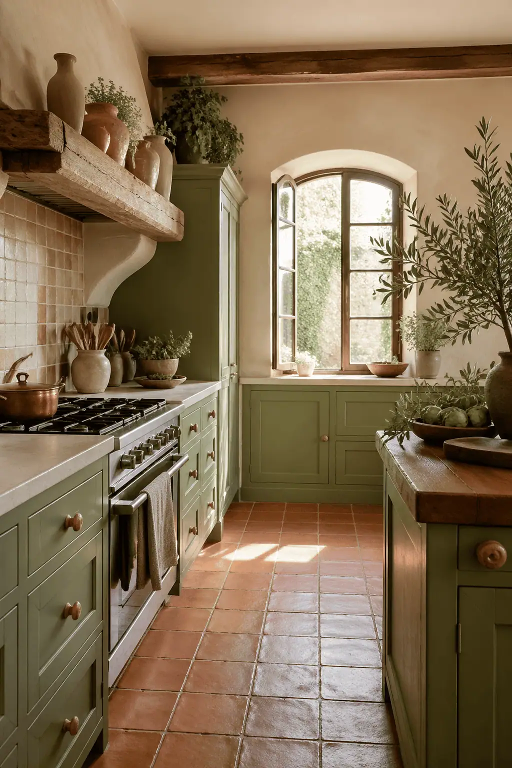
I don't think I can find anything negative to say about an artichoke green with a terracotta floor tile. What a combination. The artichoke paint and the terracotta floor are contrasting yet complementary, with real color theory behind it. Terracotta tiles, whether they're new or reclaimed, are a perfect choice.
Aesthetically, but they are also so robust, so they're perfect for the comings and goings of a family kitchen. I chose terracotta flooring for my boot room, entrance hall, and utility room, and there have been no regrets. Add wood knobs to soften the space and add contrast. Again, they're a natural material, so they prevent the space from looking too designed.
12. Fern Green + White Shiplap + Polished Nickel
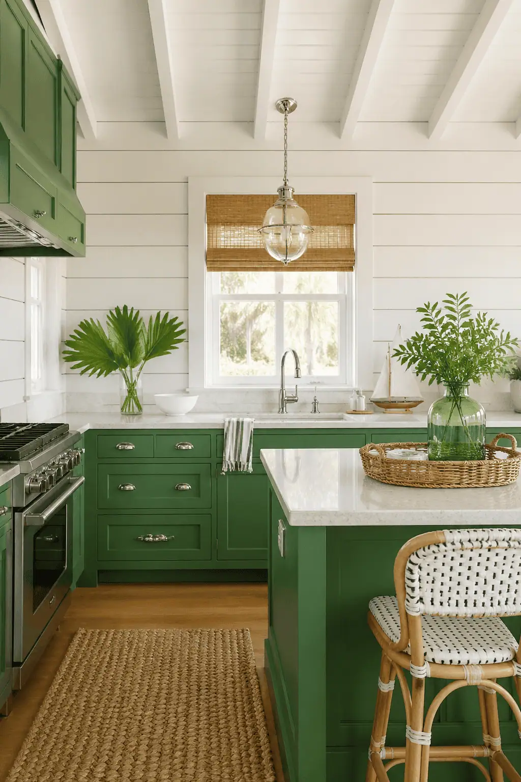
What about Fern Green with white shiplap and some polished nickel? I love Fern Green. It's lively, but it's still livable. And shiplap? I'm always on the lookout for being able to use that in a space. It adds interest and a real focal point without feeling too heavy. This combination gives a coastal cottage look, making the most of natural light and giving an airy, lofty appearance.
The sort of place you want to while away your hours with friends and family. Polished nickel hardware is an alternative to chrome because it's warmer and softer. It's a choice that's often overlooked, but one hundred percent worth considering.
13. Pale Sage + Light White Oak + Matte Black Pulls
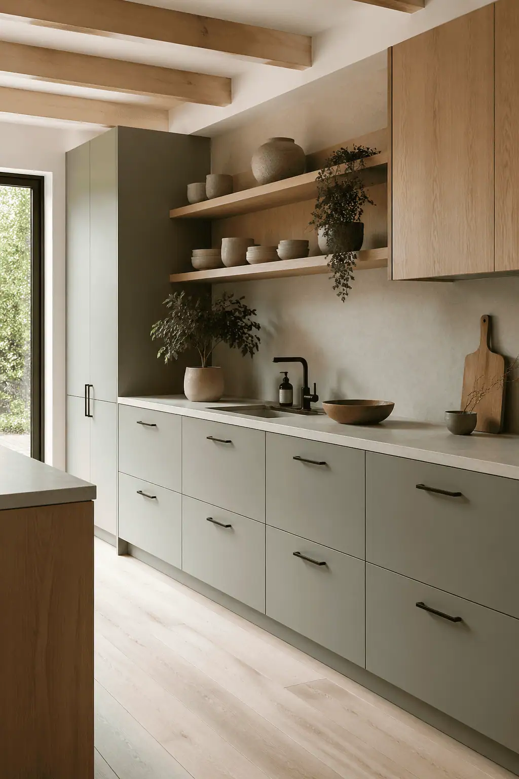
I'm a big fan of Scandinavian and Japandi design. They share the same values of simplicity, and if you enjoy them too, recreate that look with a pale sage, using it as a neutral on your cabinets. Pair it with white oak for its lighter grain, and incorporate matte black hardware to provide the only high-contrast element and serve as the anchor of your room. If you want the true Scandinavian look, don't be tempted to go too dark on your green.
You're aiming for airy and bright, because that's what the style depends on. While Scandinavian design aims for an uncluttered space, this doesn't mean you can't add your own personality with some key decor pieces such as stacked recipe books, a vase full of flowers, or a Scandi-inspired teapot. The key here is choosing silhouettes that match the style.
14. Mint Green + Terrazzo Countertops + Chrome Hardware
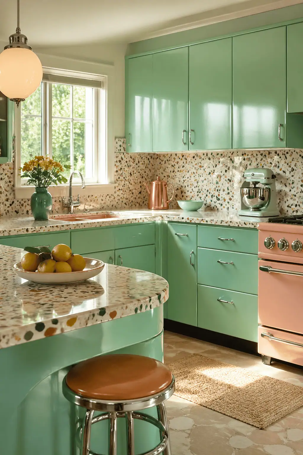
If the 1950s retro style is your thing, consider choosing Mint Green and adding Terrazzo countertops and chrome hardware. Retro is making a comeback, but to avoid it feeling too trend-driven, limit your material palette and avoid too many competing patterns.
Terrazzo, while stunning, is already busy, so include it on one surface only and keep the remaining walls and floors pared back and simple. It's important here to let the era of your home lead the way, so don't force the retro style into a home that doesn't support it.
15. Celadon Green + Fluted Glass + Minimalist Edge Pulls
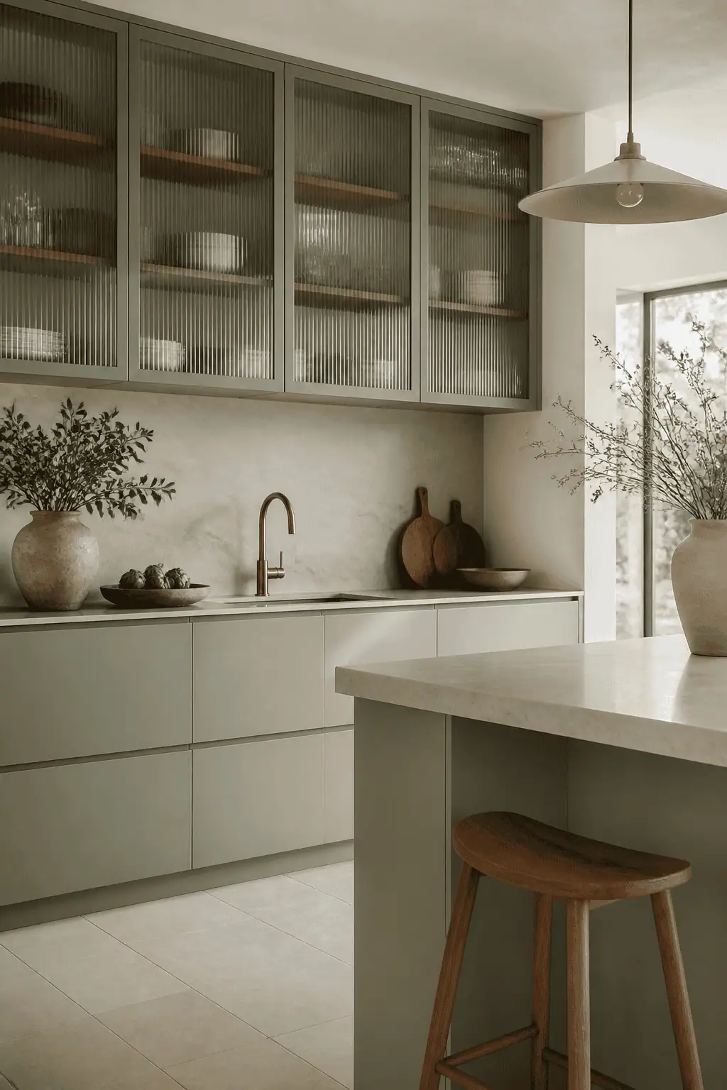
Celadon Green, with its soft grey undertones, is perfect for contemporary kitchens if you want to go cooler than sage. Add fluted or reeded glass cabinets for interest and top-mounted pulls to give clear sightlines throughout.
If you don't want the fluted or reeded glass everywhere, choose it for a focal point, such as a larder cupboard or freestanding unit, and use it for storage to display your favorite treasures, books, or liquor.
16. Pistachio Green + Geometric Backsplash + Walnut Flat-Panels
If you love mid-century modern, pick out pistachio green. Add a focal geometric backsplash to anchor the space alongside walnut flat panels. The grain of the walnut does all the talking, grounding the space aesthetically.
For the backsplash, choose a hexagon, elongated hex, or chevron tile. These are all true to the era and really should take center stage. You want it to stand out in a way that when a guest enters the room, they go, Wow, look at your backsplash!
17. Gray-Green + Poured Concrete + Integrated Finger Pulls
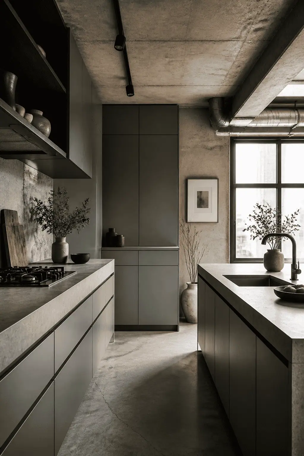
If you want an industrial feel, or you have a very large space to fill, consider gray-green paint with a beautiful poured concrete worktop and integrated finger pulls. I am a huge convert to poured concrete, but do your own research. It will need plenty of maintenance, including regular sealing to make sure it doesn't stain. Choose a mix that lets the aggregate shine through, so you see the exposed flecks as you move around the space.
You can also use concrete as upstands on your wall, behind ovens and taps, and extend them high enough to meet an open shelf to display some of your favorite kitchen items. I have seen this combination work beautifully in big converted barns with open-plan living spaces and in terraced houses on the streets of London with a retro feel, so what I'm saying here is it can work in almost any space, provided the design is done well.
18. Seafoam Green + White Quartz + Brushed Brass
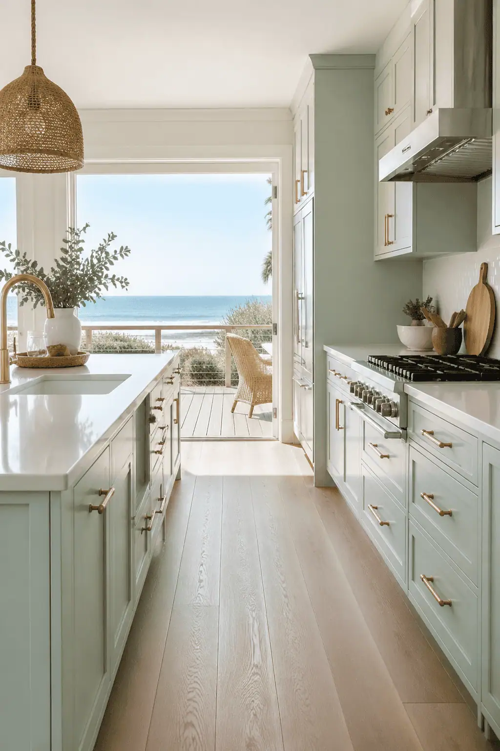
If you live by the coast, or just want an ocean-inspired kitchen, opt for seafoam paint with a white quartz worktop. This gives a light, airy feel with clean lines and an uncluttered feeling… think long summer evenings with sandy toes! Quartz works perfectly aesthetically here because of its bright, fresh look, and because it's man-made, it's non-porous and fairly indestructible.
Brushed brass hardware and even a kitchen tap will soften the space and complement the blue-green of the paint. Add in plenty of wicker decor, such as pendants, storage baskets, or trays, plus layered wooden chopping boards propped up casually, to give that effortlessly lived-in look. I love the idea of a sculptural piece of driftwood hung like artwork above doors to blur the lines between the outside and the inside… when do I move in?!