Just because your apartment's living room is small doesn't mean it has to feel cramped. With the right arrangement, a small room can feel a lot more spacious. Most people are tempted to buy tiny furniture or push everything against the walls, which can decrease the perceived space. A smart living room arrangement is really about perception. Think clearances, scale, flow. No need to buy new furniture.
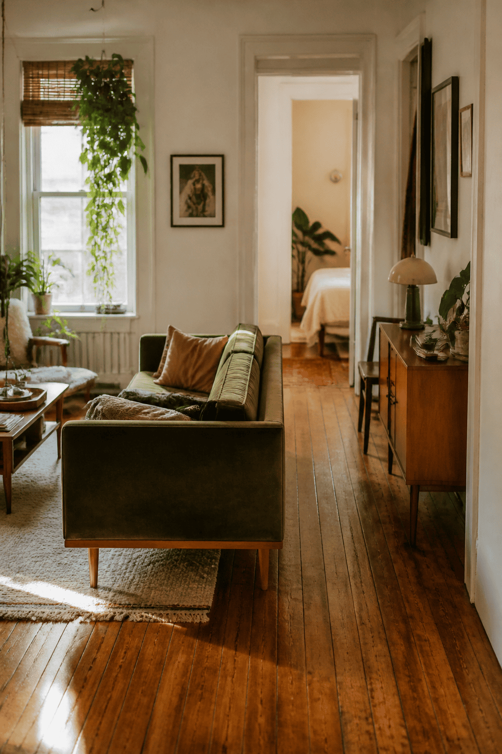
A few numbers go a long way here. Your sofa and coffee table should sit about 14 to 18 inches apart, close enough to reach your drink but with room to stretch your legs. Main walkways need at least 30 to 36 inches so the room doesn't turn into an obstacle course. Get those clearances right, and the whole room starts to feel less tight, even if nothing else changes.
1. The Floating Sofa Divider
When your living room is narrow, you might feel like your only option is pushing everything against the wall. But pulling the sofa away from the wall by about 36 inches is a better idea (although 42 to 48 inches is most comfortable, depending on your living room layout).
Floating furniture, which is just another way of saying away from walls, is a core design principle. Placing furniture against the wall can make the room feel smaller. But floating furniture offers a two-zone illusion, which works because the brain reads the gap as a room boundary.
You might be worried that the sofa will block the room. But the exact opposite is true with a narrow layout. This type of arrangement works best when the sofa back is finished and clean-lined. Avoid pieces designed to be seen only from the front.
2. The Two-Loveseat Parallel
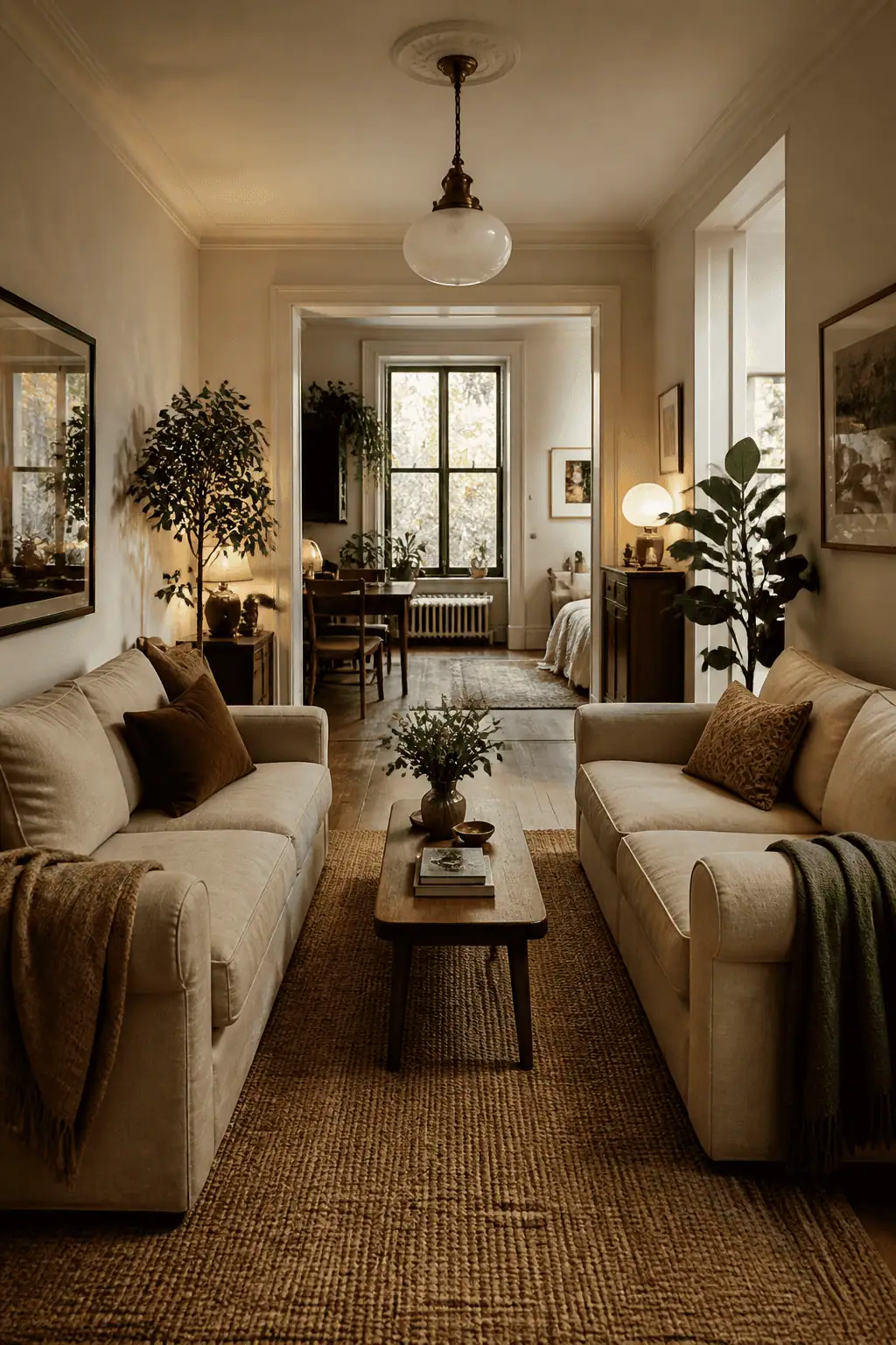
A standard three-seater sofa can take up to 96 inches of horizontal space. Swap it for a pair of facing loveseats, which usually run between 52 and 66 inches, and that swap can save around 30 inches of wall run. The classic face-to-face layout creates a nice little conversational zone that will anchor your long room. It also leaves the room ends free, which is good for circulation paths, and gives you a bit of additional space if you want bookshelves or other types of vertical storage.
Opt for two loveseats that don't exceed the original sofa's footprint, as the total seating depth will double. Before buying, check the clearance from front to back. This arrangement works best in rooms that are about 12 feet wide and long. In shorter rooms, it could feel confrontational rather than cozy.
3. The Angled Accent Chair Approach
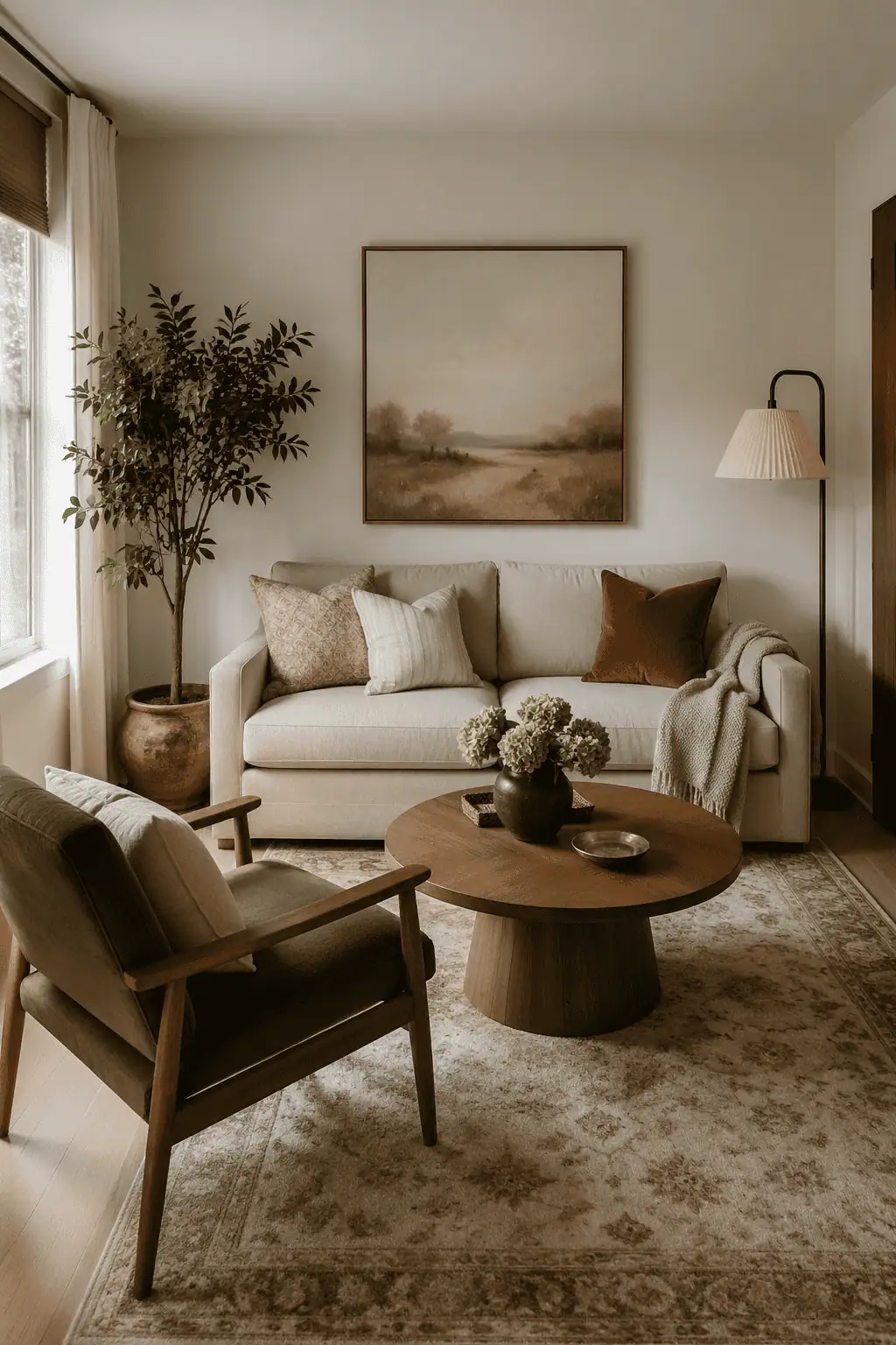
Angling one accent chair slightly inward can break up a boxy room's rigid feel and add dynamic flow to your small space. It draws the eye diagonally, which is the longest line in any room. In other words, it makes the space feel larger.
The little accent chair is perfect for angling, as it has a lower visual weight than a sofa, and it's easy to move. The change can literally take you about five minutes, and it doesn't anchor the room. Just be careful not to angle too many pieces at once, which can create a sense of chaos. One chair is more than enough.
4. The Long Wall Gallery Anchor
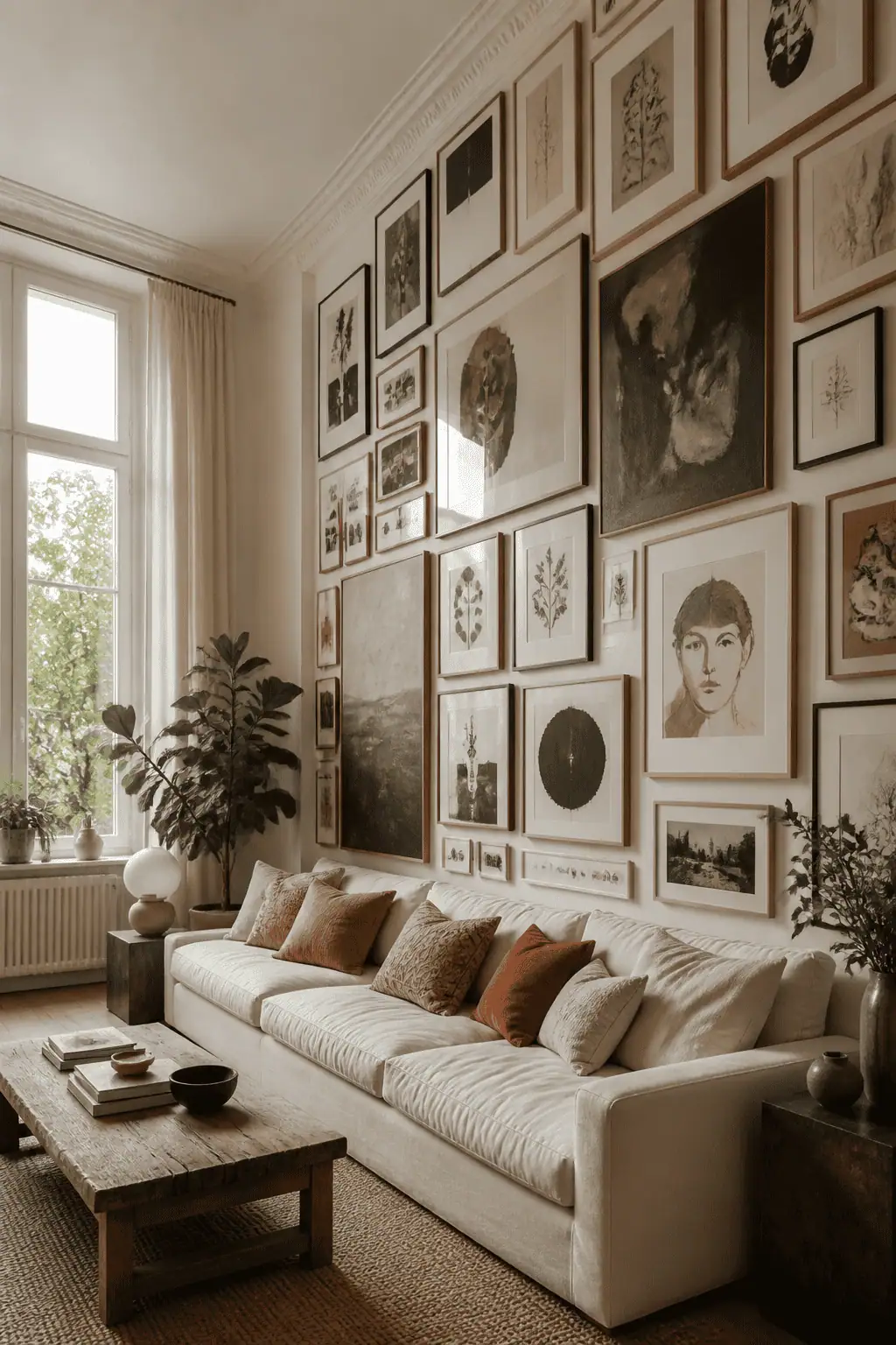
If your apartment is especially narrow, think between 10 and 12 feet wide, push the sofa against the long wall, and then anchor it with a floor-to-ceiling gallery wall. That will balance visual weight and draw the eye upward. The floor-to-ceiling gallery works because vertical lines elongate the perceived height, making your room feel bigger.
Do avoid hanging art too low or in a tight cluster, because that will reinforce the horizontal crush rather than counter it. You don't need to worry about matching frames. Actually, the more varied they are, the more it will naturally fill the vertical space and add energy to the room.
5. The Bookshelf End-Cap
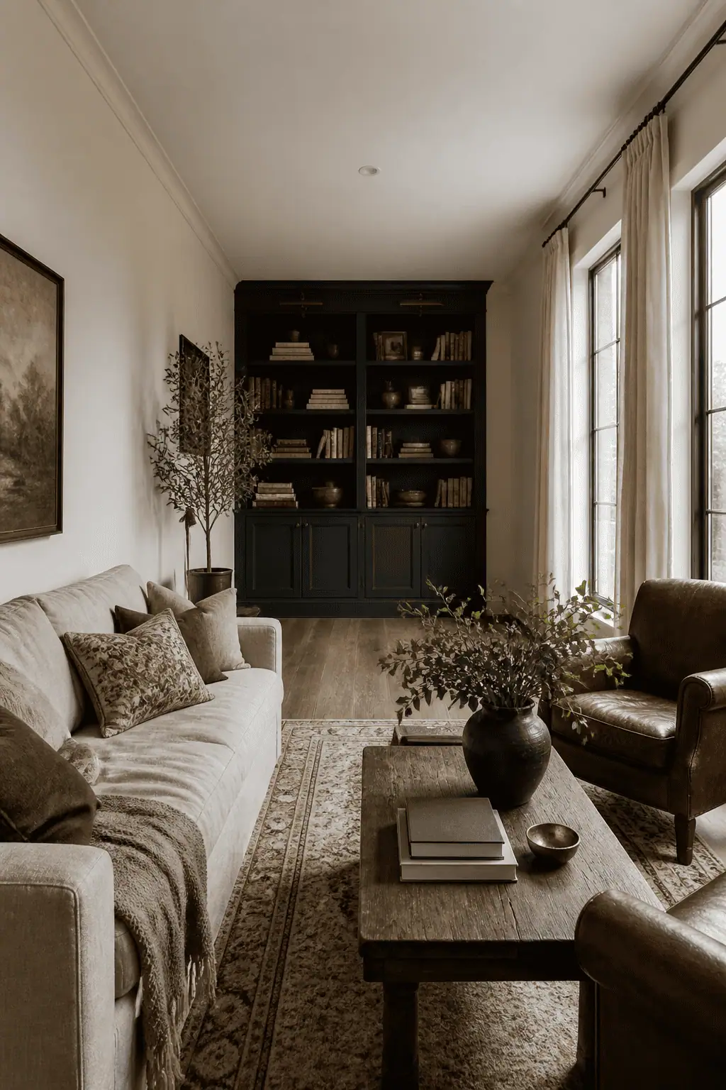
If your room feels uncomfortably long, adding a tall and dark bookshelf at the far end can visually shorten it. These types of long, narrow rooms are common in older homes and in open-plan layouts. Adding a dark bookshelf anchors the far wall.
Make sure the bookshelf is tall enough to cover the entire wall, as a tall piece will draw the eye up and across, creating a focal point that interrupts the tunnel effect. When styling the shelves, make sure to include books, objects, and art to create visual density, because a sparse shelf won't have the same stopping effect.
Alternatively, you could simply try painting that wall a dark accent color. A small sofa that floats away from the wall can help, too, but the bookshelf is really the ideal piece of furniture for this function.
6. The Sofa-Backed Dining Zone
In an open-plan apartment where the living and dining area are the same room, place the dining table directly behind the sofa. That way, you create two defined zones without blocking any light. Sofa backs are usually 30 to 36 inches high, which is just about enough to signal a zone change without acting as a visual wall. One key benefit over room dividers or bookshelves is the lack of light obstruction, leaving sightlines fully open.
Do avoid leaving a gap between the sofa and the table, though, as pushing them close together will make the boundary read clearer. This arrangement works best when the heights of the sofa and the dining chair are more or less the same, as mismatched scales can undercut the separation effect.
7. The Rug-Defined Living Square
Strategic block placement is great for controlling traffic flow and separating areas, like the living area from the sleeping area to the dining zones, especially if you're living in a small studio apartment. If you add a large area rug, about eight by ten, with furniture front legs on it, and you just place the sofa legs on top of the rug, it creates a defined living room zone that signals a room boundary to the brain, even without walls. Make sure the sofa's front legs are on the rug, which will serve as an anchor.
You can also add pendant lighting overhead or a sofa facing away from the rest of the space; the rug will work just fine alongside these anchor tools. It's just a great way to make your entire apartment feel organized.
8. The L-Sectional Corner Trap
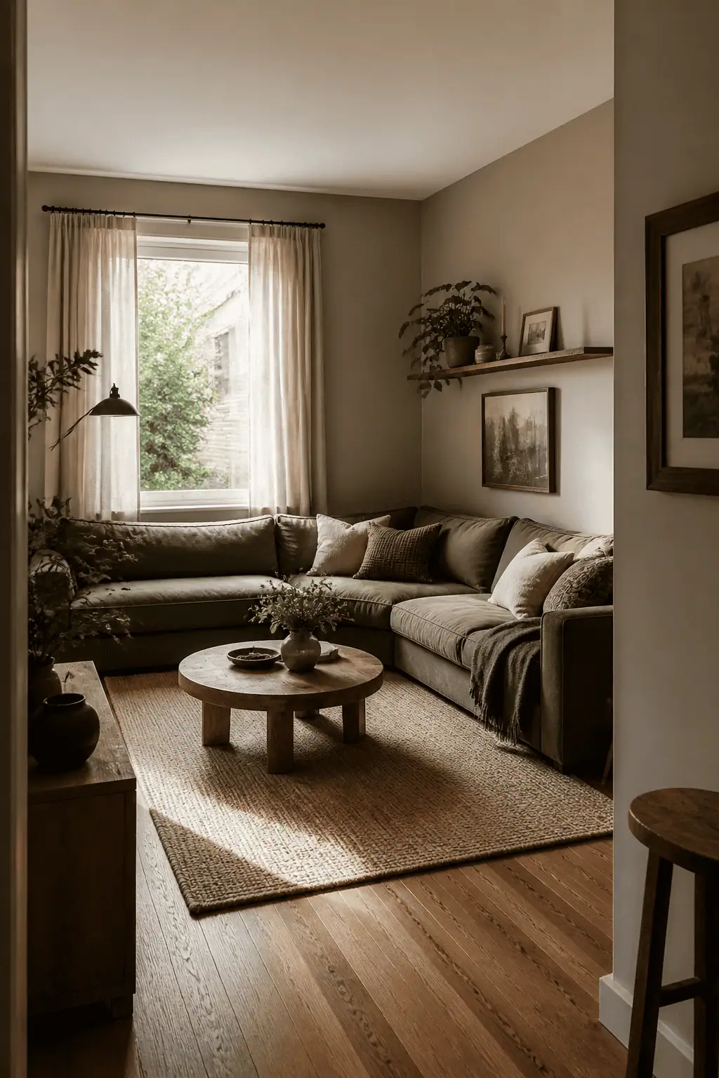
Open-concept rooms need visual anchors. That's where a corner sofa sectional can help define the living zone without physical dividers. Tuck an L-shaped sectional into the far corner of your open-plan room. This way, you save space by hugging the walls and leaving the center open. L-sectionals typically seat up to seven people, while a sofa seats only three, so they take up much less space per seat in a smaller room.
Furniture against walls frees up the room's central square footage, which is the most valuable circulation space. Just make sure your sectional ends before a doorway or a traffic path rather than blocking it. Opt for a low-profile back, which keeps sightlines open, whereas bulky high backs in the corner can read as a cluttered wall of furniture.
9. The Console Table Buffer
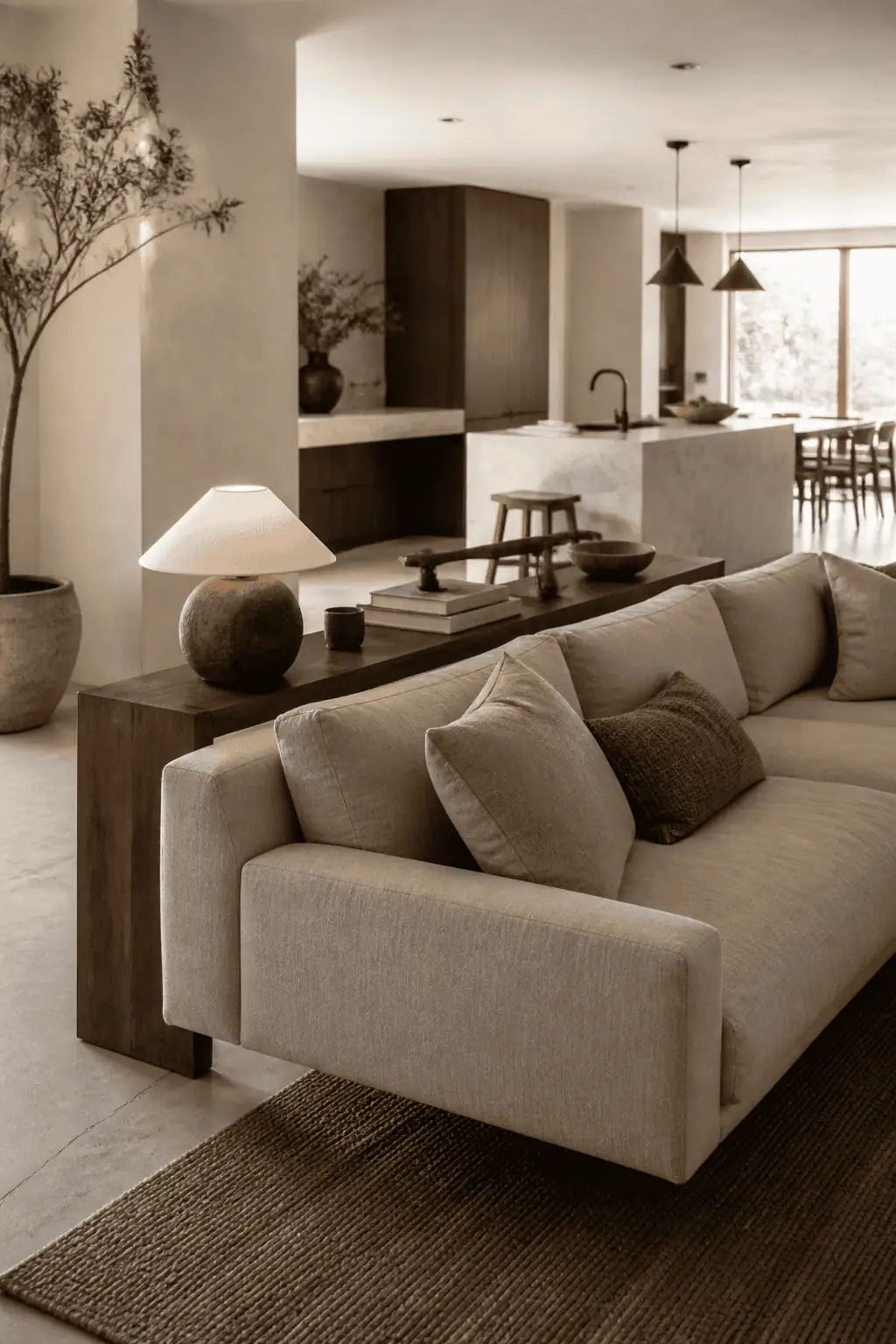
When you have a floating sofa in an open-concept space, the back can feel unfinished. Sliding a slim console table behind it finishes that exposed back and creates a buffer zone with additional storage space.
Console tables are generally about 10 to 15 inches deep, making them narrow enough not to eat up floor space while remaining functional. Avoid choosing a console that's too tall. Ideally, it'll sit at or just below the sofa back height, generally about 28 to 32 inches.
What makes a console table a good addition is that it can easily serve as a surface for your keys, lamps, or even books, making it more functional than a purely decorative piece. It's also the perfect spot to add a lamp as a light source behind the seating area for some added ambient light.
10. The Swivel Chair Bridge
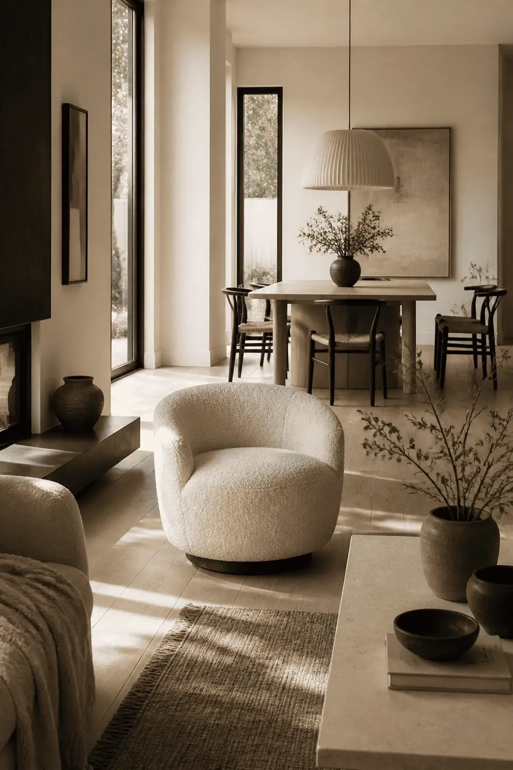
Place a low-profile swivel chair on the border between the living and dining zones. It can act as a multitasker, facing either space as needed. The swivel chair works because its rotation gives it a dual purpose without the need to move furniture.
Low-profile means no bulky arms or high backs, as those can block sightlines and make a small space feel even tighter. It's also a useful trick if you have a home office tucked into your living room corner, as the same invisible border pivot trick applies.
11. The Window-Facing Focal Point
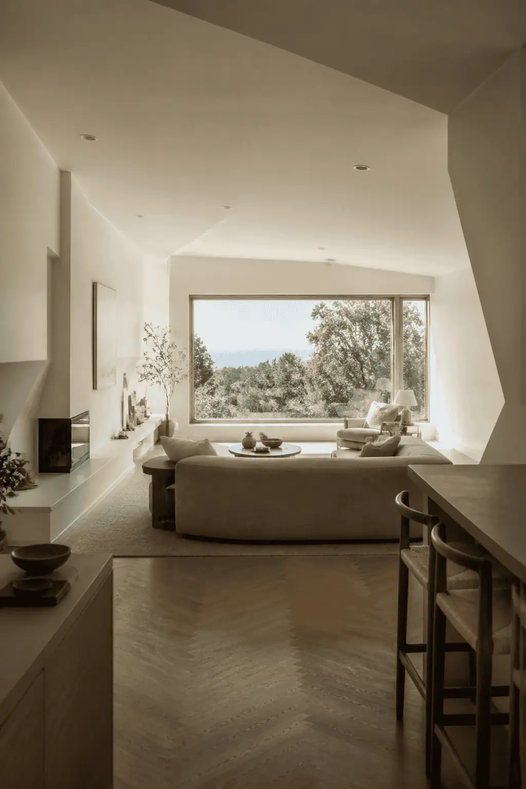
Awkwardly shaped rooms, think L-shapes, odd angles, or alcoves, can be improved dramatically if you arrange the seating to face a large window. This way, you're using natural light instead of fighting those odd angles. Add a swing-arm TV in the corner if you still need a screen.
Focal points are important because they visually anchor a room. When the room lacks one, the eye doesn't know where to land, making the space feel unsettled. Windows work best for this. And natural light is great for making the room feel larger and more alive.
12. The Diagonal Rug Anchor
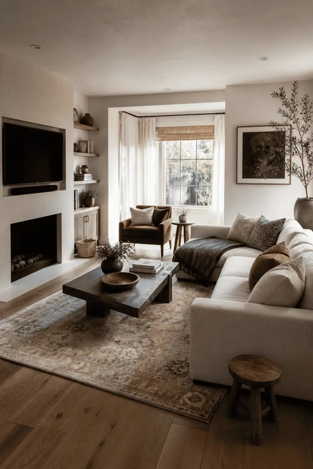
L-shaped rooms often feel disjointed because the eye follows the walls and notices the asymmetry. That's where diagonal placement comes in. It breaks the room's grid and redirects attention away from the irregular angles. If you take a rug and place it even 15 to 20 degrees off-axis, it visually widens the awkward leg of an L-shape.
Diagonal lines read as movement and can make a static room feel intentional rather than accidental. Just make sure you don't go too extreme, as a 45-degree angle can feel chaotic. Subtle diagonal placement works just as well in other awkward layouts, such as alcoves or an off-center fireplace.
13. The Nook-Hugging Sectional
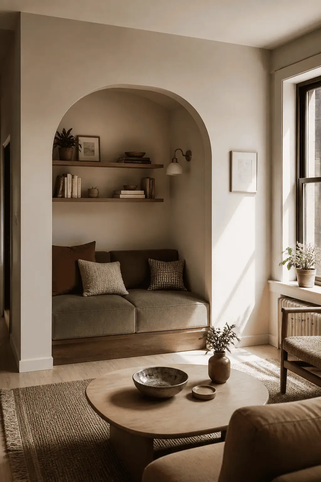
If you live in an older apartment, that awkward nook is something you can embrace with a modular sofa or a bench, turning your apartment's little quirk into a cozy seating area. In older buildings, nooks often result from structural elements such as chimneys, staircases, or load-bearing walls.
Opting for a modular sofa, such as the IKEA Söderhamn or a similar model, allows you to configure pieces to non-standard widths without paying custom prices. However, a tailored built-in bench with storage underneath can maximize the nook space twice over, giving you seating and additional hidden storage.
Avoid choosing a piece that's too small for your nook, as that awkward gap can make it look accidental and not the intentional vibe you're going for. A snug fit is what makes it feel deliberate. The idea is that your awkward architectural constraints become features, not problems.
14. The Off-Center TV Balance
Space constraints often mean there's no other place for your TV but off-center. In that case, you can visually balance it with either a tall plant or a gallery wall, because visual weight matters more than perfect centering.
Having visual balance doesn't need to mean symmetry. It's about perceived weight on each side of a space. That's where tall plants come in, as they carry significant visual mass, making them very good counterweights for your media console. A tall gallery wall will work similarly, as a cluster of frames can read as a single heavy element. As a rule of thumb, the counterweight elements should be roughly as tall as the TV-and-stand combination.
15. The Bed-Adjacent Settee

Micro studios are hard to separate into distinct living areas. Placing a small settee or loveseat at the foot of the bed can create a visual divide between your sleeping and living room zones. Typically, a small upholstered sofa or loveseat runs about 48 to 60 inches, making them ideal for small spaces. The settee back will read as a room divider without the need for a wall, and it also gives that high-end hotel vibe, a trick a lot of luxury hotels use to make their rooms feel bigger.
Try not to go over 30 inches in depth, because that will eat floor space fast. Opt for either a backless or a low-profile option to keep the sightlines open. Also, make sure your settee is facing outward, away from the bed, as this anchors the living orientation so you're not always staring at your pillow.
16. The Ottoman Coffee Table Swap
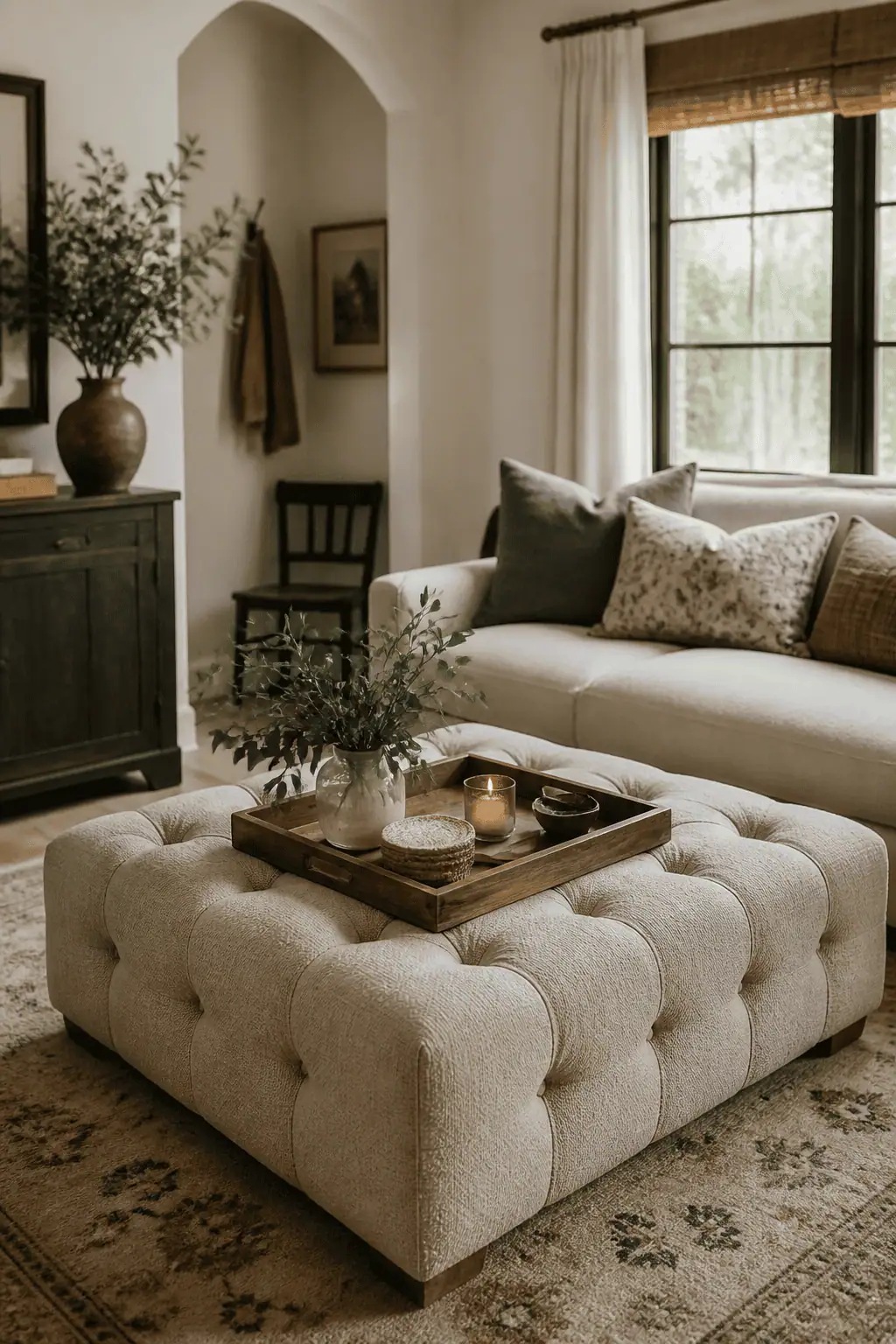
In a tiny living space, using an ottoman with a tray as a coffee table offers you a surface and a seat when needed. The tray is functional because it provides a stable surface on the soft upholstery, so you can use it for drinks, remotes, or whatever else. The lack of hard corners found on typical coffee tables means the room reads as less cluttered and more open.
Avoid undersizing the ottoman. It should be roughly two-thirds the length of the sofa, more or less the same size as you would have for a standard coffee table. Storage ottomans come with the bonus third function too. You can use them for blankets, remotes, books, and your stuff.
That said, this solution is not ideal if you need a firm surface constantly, as the tray can slide or tip with heavier loads.
17. The Wall-Mounted Media Layout
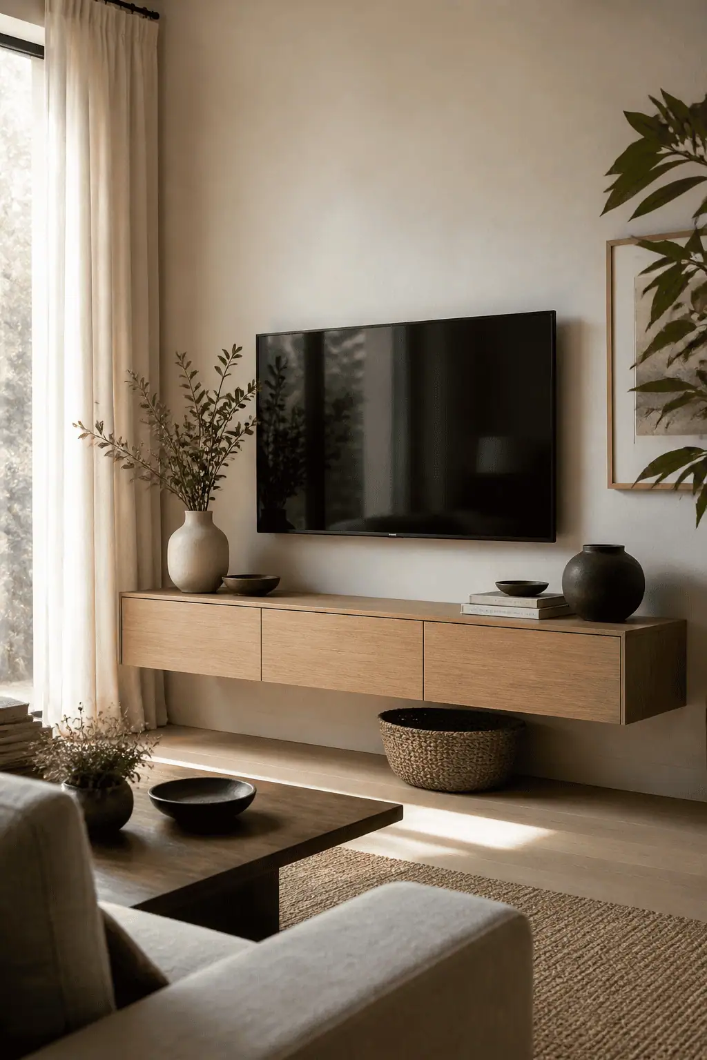
One way to make a small, full room feel larger and reclaim floor space is to ditch the heavy TV stand and opt for a wall-mounted one instead. Floating consoles are great for creating visual continuity, and the unbroken floor line reads as wider to the eye. Typically, your TV stand will take about 4 to 6 square feet of floor space, whereas a wall-mounted unit frees up all that space.
Pick a wall-mounted unit with the right weight rating, as most drywall anchors can support 20-50 pounds, whereas heavier units require studs. Also, try to avoid mounting too high or hiding all the floor gain with clutter underneath, which defeats the purpose of the wall-mounted stand.
18. The Ghost Chair Illusion
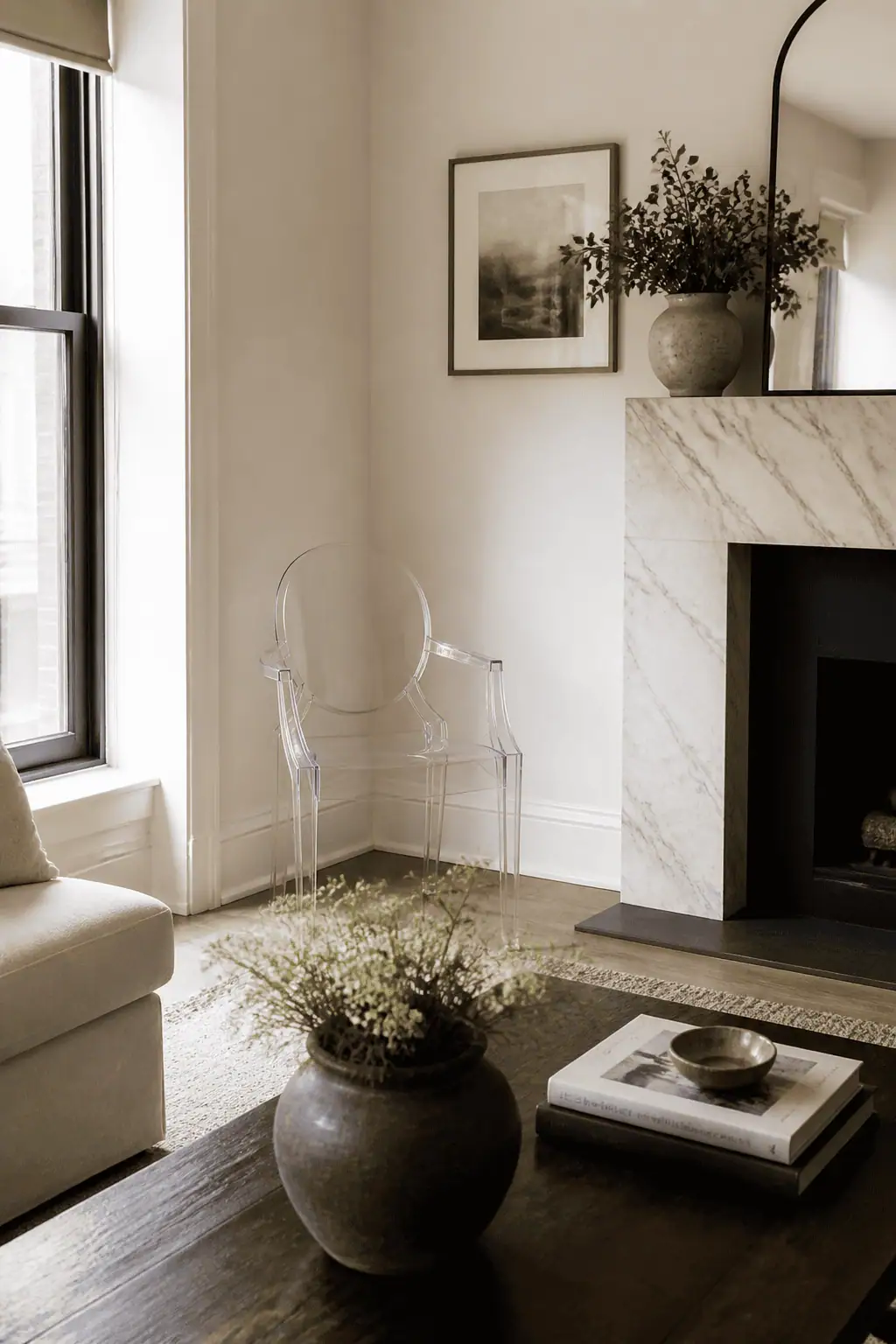
A clear ghost chair can add accent seating to your room without adding visual heaviness or visual weight. The ghost chair, originally designed by Philippe Starck, was introduced in 2002 for Kartell as the Louis Ghost. It's widely imitated at all price points now. The transparent chair works especially well in corners or entryways where a solid chair would block the sightlines or make a tight passage feel even narrower.
One downside is that this type of chair shows fingerprints and scratches easily, so it needs to be wiped down regularly. It's also not a magic fix for every style; it would look weird in a rustic or maximalist-designed room. However, it is a great fit for modern, minimalist, or eclectic spaces. Do make sure you measure your space and the chair to ensure it fits before you commit to a purchase.