We've all seen it: the wooden script sign hanging right over a headboard, the one that says Love or Sweet Dreams in looping cursive. It's fine. It's also one of the most defaulted-to decisions in bedroom decorating, which is exactly why it ends up feeling like nobody made a decision at all. Your bedroom is where you spend roughly a third of your life. That strip of wall above the headboard isn't dead space - it sets the entire mood of the room, adds or kills the sense of scale, and either makes the space feel like yours or like a hotel that's trying a little too hard.
Theo Bennett here. I spend a lot of time thinking about why certain design choices actually land while others feel like they came pre-selected. Moving past the clichés requires paying attention to three things: scale, material, and how a piece interacts with light at different times of day. Here are 13 ways to fill that space with something that feels genuinely intentional.
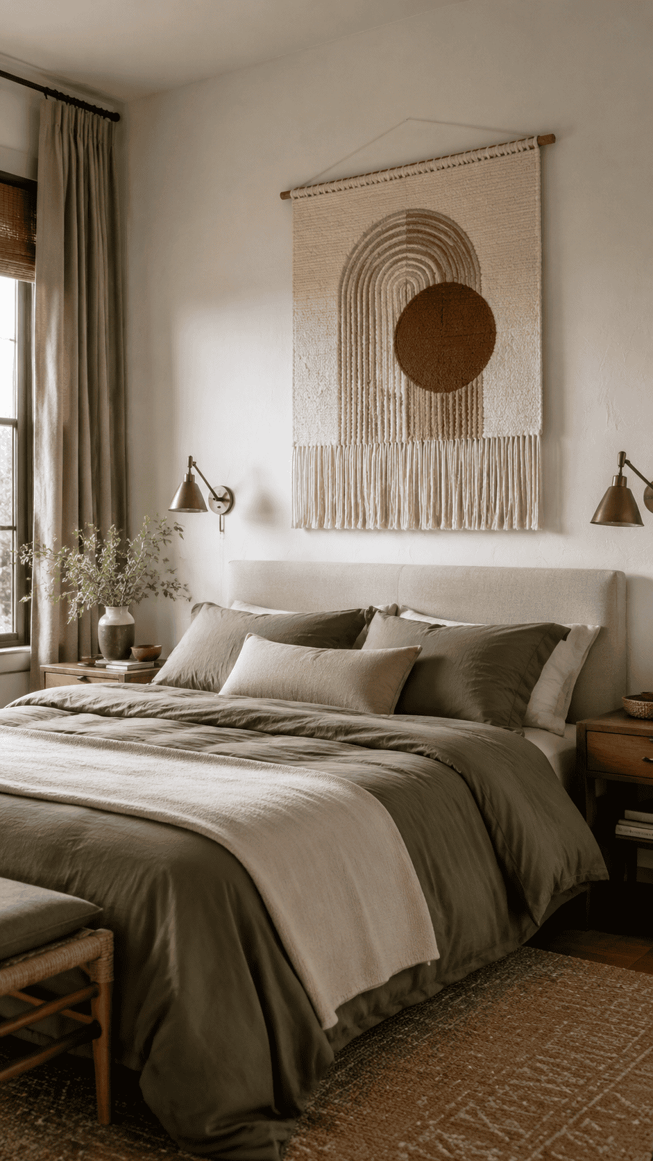
1. Large Dip-Dyed Macrame Wall Hanging
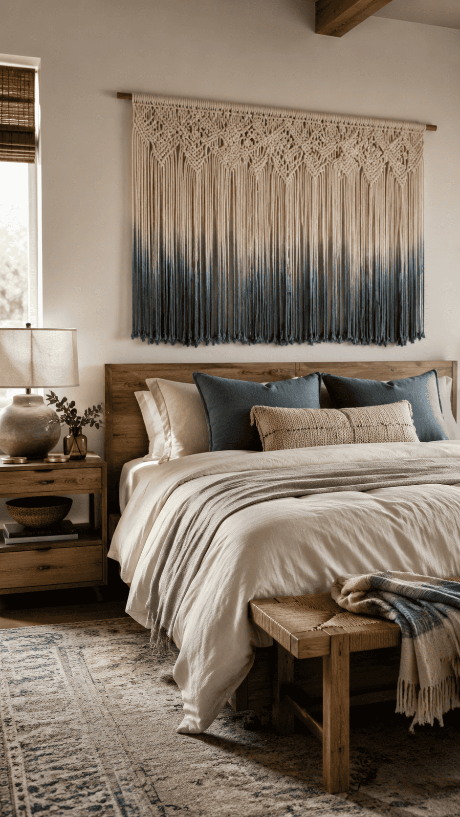
When people say they want warmth in a room, fiber is almost always the answer. A large macrame wall hanging - specifically a dip-dyed version - does something that canvas and metal simply can't: it introduces actual texture you can see from across the room. The way yarn catches and softens light is fundamentally different from how a framed print does it.
Look for a dip-dyed piece if you want to pull in a specific color from your duvet or curtains without committing to a full paint change. The gradient means you get color without the piece reading as a flat slab on the wall. It sits comfortably in Boho spaces, but it also works in rooms leaning towards Japandi, where the handmade quality counts for a lot.
2. BAYKA Floating Shelves: A Display That Can Change
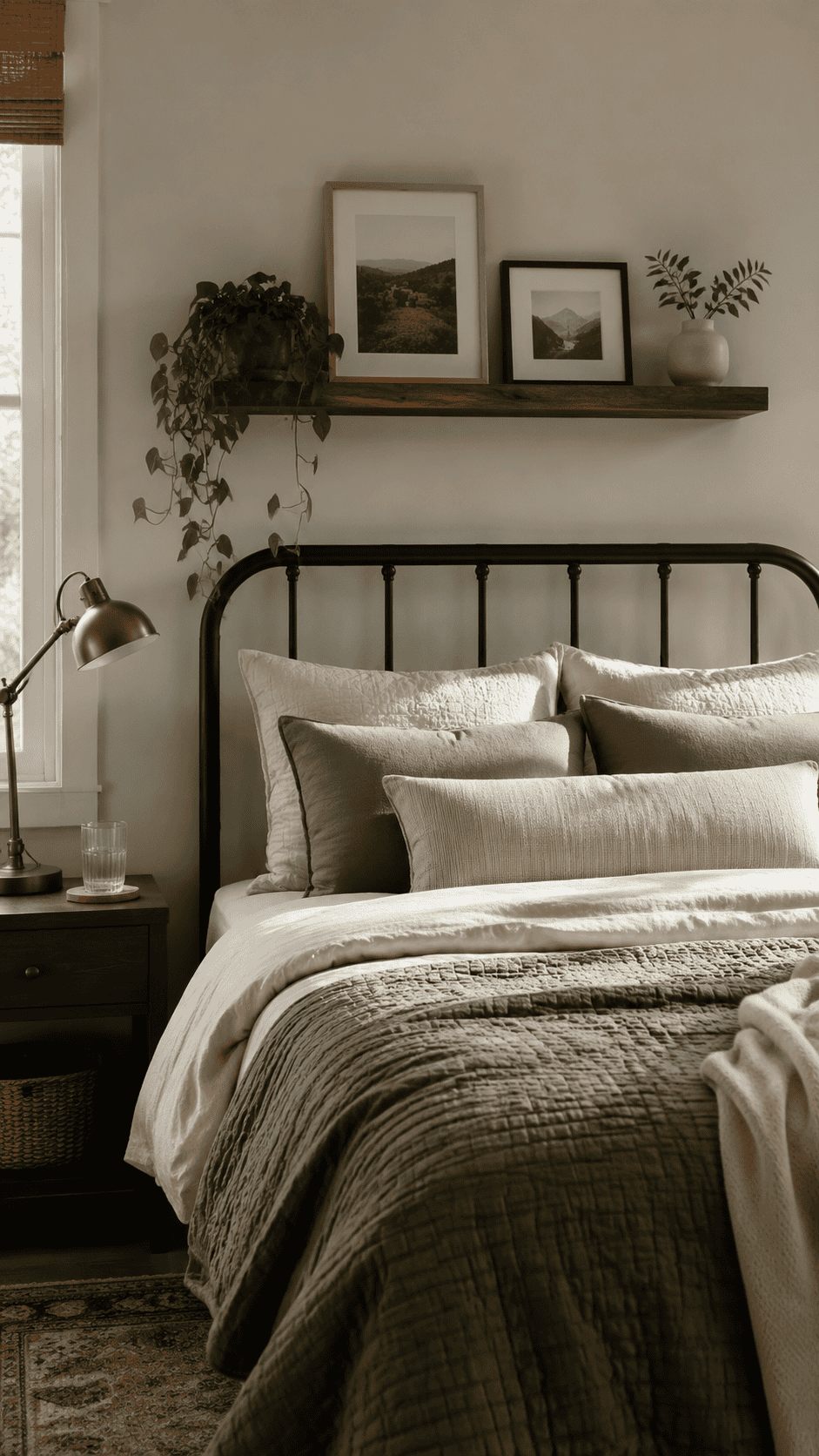
Floating shelves above the bed are an underrated decor strategy. Instead of locking yourself into one large piece of art, you get a surface you can rearrange whenever your taste shifts - which, if you're anything like me, happens roughly every time you see a new set of pillowcases you like. Lean a few smaller framed photos, let a trailing pothos spill over the edge, and prop up a book with a cover worth looking at.
The rustic wood finish on the BAYKA shelves lends the wall visual weight without feeling heavy or industrial. One practical note: install them high enough that sitting up in bed to read doesn't become a forehead situation. About 12 inches above the top of the headboard is a reasonable starting point.
3. The TaoliMo Gold Sunburst Mirror Does More Than Look Good
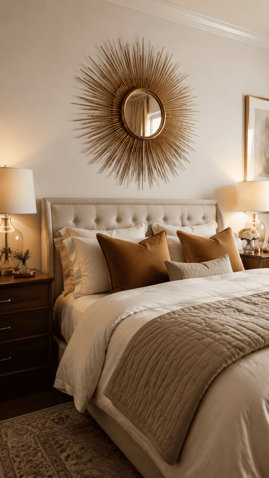
A sunburst mirror is a Mid-Century Modern classic because it functions like a piece of architectural jewelry. It draws the eye toward itself and then outward along the spokes, which creates the impression of expanded space. The TaoliMo gold version is particularly useful in bedrooms that feel either small or dim - mirrors push reflected light back into the room, and the starburst silhouette pulls the eye upward, making the ceiling feel a few inches higher than it actually is.
Gold reads as warm, so this works well with amber or warm-white bulbs in your bedside lamps. Under cooler lighting, it can edge toward flashy, so factor in your existing light sources before committing.
4. LANCHI95 Vintage Gallery Wall Art Set
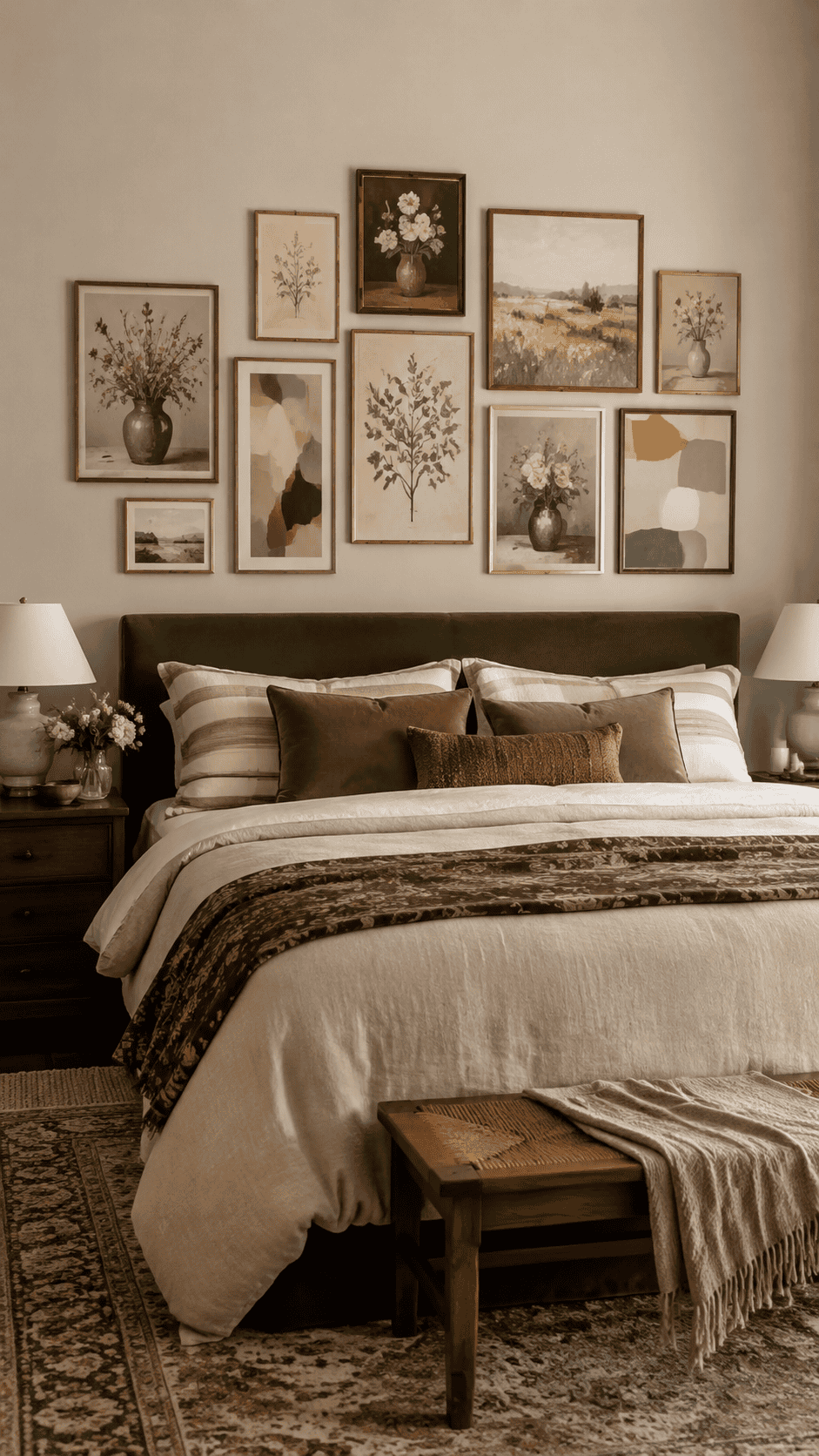
The goal of a good gallery wall is for it to look like you assembled it slowly, the way someone might pick up a print at a market in one city and a small botanical illustration at a thrift store in another. This set of 10 framed prints gets close to that feeling because the pieces share a color palette without being matchy-matchy. Florals and abstracts sit together without clashing.
It's a smart choice for a king-sized bed with a wide horizontal wall to fill, since a single frame above that scale of bed almost always looks like it got lost. Pre-matched sets like this take the guesswork out of cohesion. The "collected over time" look is mostly about color story, and this set handles that for you.
5. Rajukit Geometric Metal Wall Art: When You Want Structure, Not Scenery
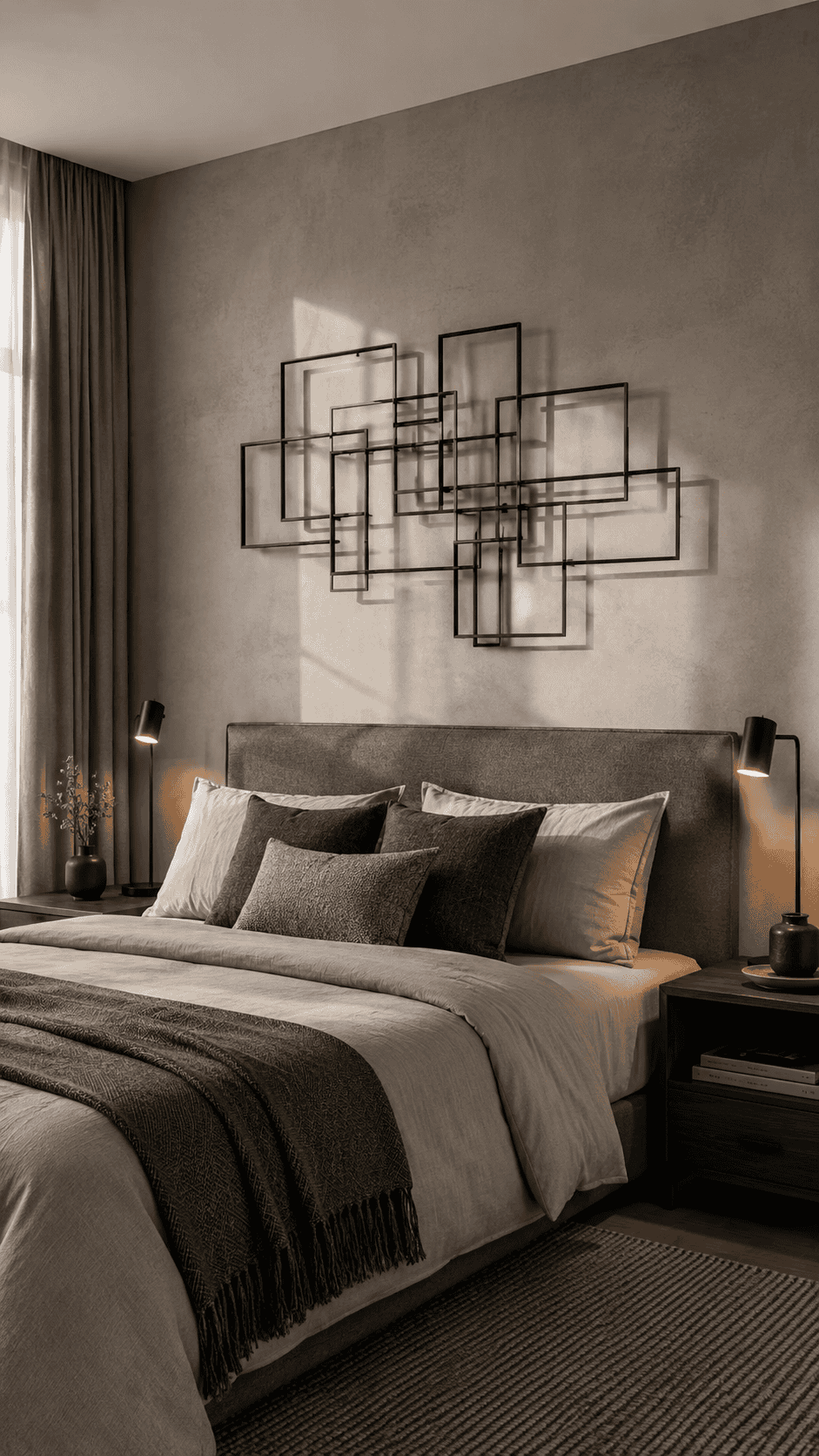
Not every room wants a landscape or a floral arrangement. For spaces leaning Minimalist or Industrial, a metal wall sculpture does something a canvas can't: it creates actual shadow play. When your bedside lamps are on, the open-frame geometry of a piece like the Rajukit Modern Geometric Abstract Metal Wall Art casts secondary shapes onto the wall behind it. The piece becomes two pieces - the object itself, and its shadow.
Because the design is open-frame rather than solid, your wall color reads through it. That keeps it from feeling heavy or visually oppressive above a bed, which is a real risk with large metal art in smaller rooms.
6. One Big Framed Landscape Can Anchor the Whole Room
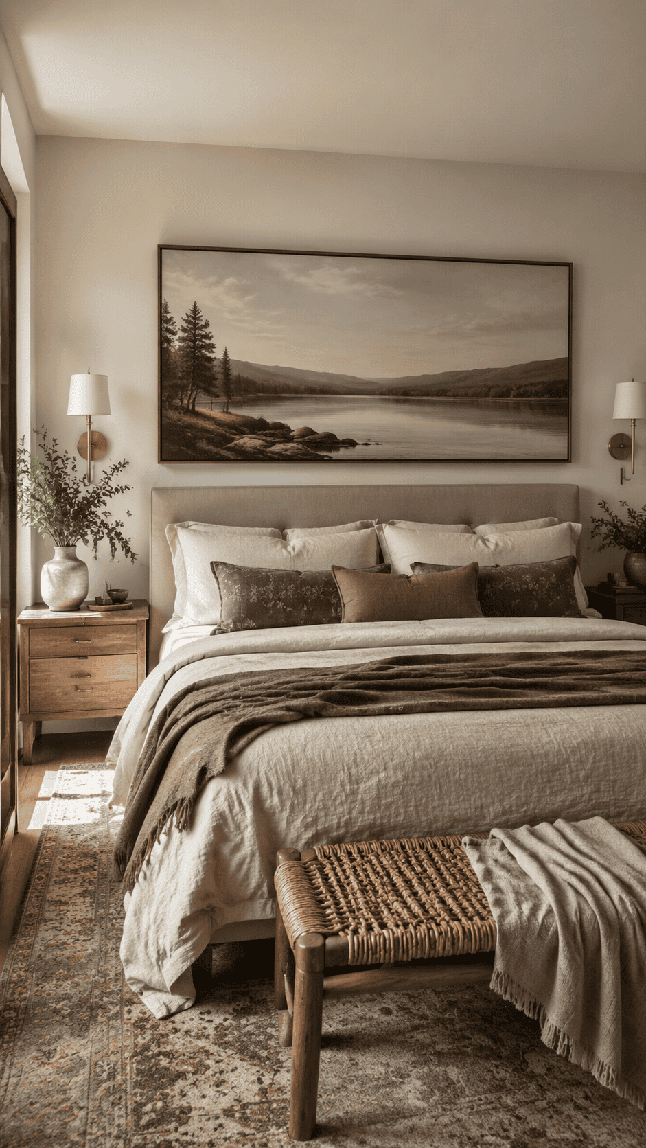
Sometimes the right move is simplicity. A single large horizontal canvas - a lake, a meadow, something with a long horizon line - does a specific job above a bed: it mirrors the horizontal logic of the bed itself. When the decor and the furniture share the same orientation, the room feels organized without any extra effort. It's a basic visual harmony principle, and it works reliably.
Nature scenes specifically tend to read as calming, which makes them well-suited to sleep spaces. There's actual research behind this: images of natural environments lower perceived stress levels slightly compared to abstract or busy imagery. A Large Framed Rustic Canvas with a lake scene, done in muted natural tones, brings that quality to the wall without requiring you to redecorate the rest of the room around it.
"The space above your bed isn't decorating for decoration's sake. It's the last thing your brain registers before sleep."
7. Freyalife Fake Vines: Biophilic Design Without the Watering Schedule
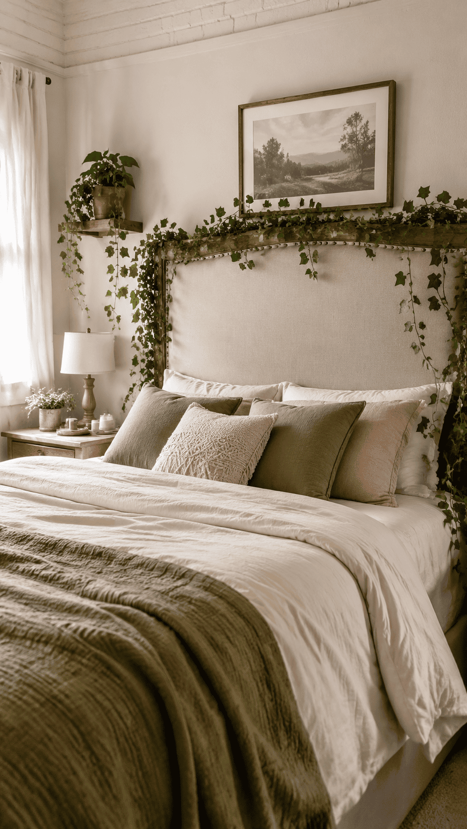
Biophilic design - the practice of pulling natural elements indoors - keeps showing up across Cottagecore, Japandi, and general wellness-focused interiors. The idea is sound: greenery softens hard lines, adds organic color, and makes a space feel alive. The problem with real plants above a headboard is obvious. Soil, insects, moisture, and the very real possibility of a trailing vine dropping dirt on your pillow.
Artificial ivy garlands like the Freyalife faux vines solve that without sacrificing the visual effect. Drape them over the corners of a tall headboard, weave them through a wall grid, or tack them loosely along the top of a picture ledge. The result is textured, layered, and convincingly natural from a distance - which is all you actually need.
8. Abstract Black Metal Wall Art in Sets of Four
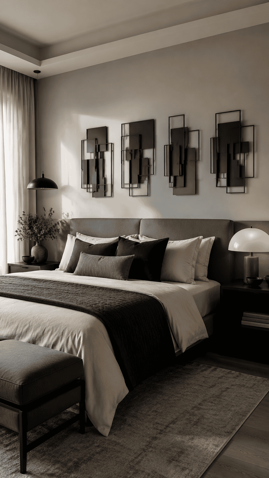
Monochromatic rooms have a specific problem: they can look flat. When everything is the same color, the eye has nothing to move between. Introducing depth - actual three-dimensional depth, not just contrast - solves this without requiring you to add color.
A set of four layered geometric wall sculptures does exactly that. The individual pieces sit at slightly different planes from the wall, so light catches them differently as the day moves. It's a more architectural solution than hanging a print, and it reads as considered rather than decorated. This approach tends to work best in rooms that already have a clear visual direction, because the pieces are abstract enough that they'll take on whatever character the room already has.
9. 97 Decor Eclectic Framed Wall Art for High-Energy Rooms
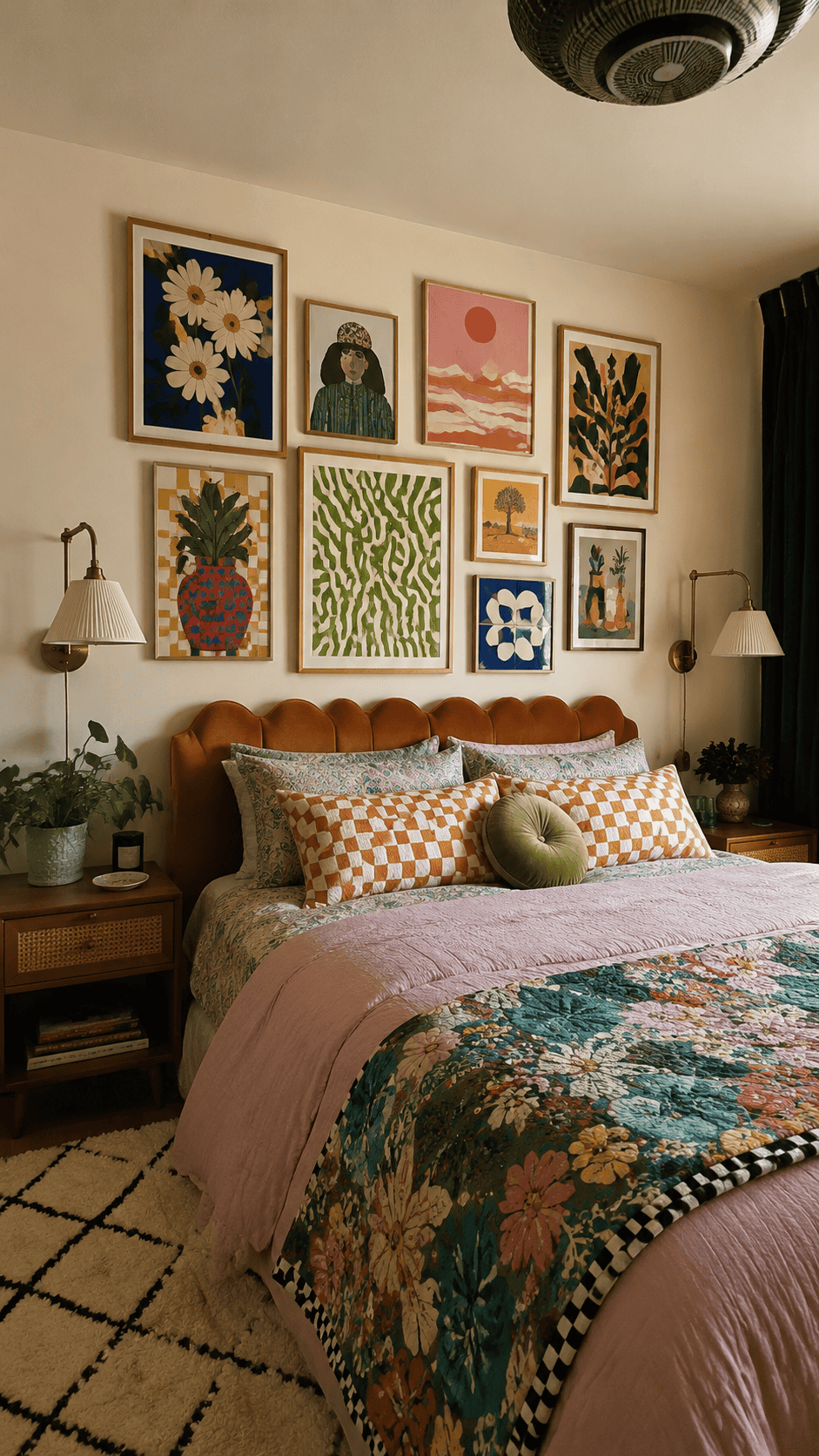
Above-the-bed decor doesn't have to whisper. If your style runs toward Maximalism, muted and serene can actually feel wrong - like putting a cardigan on someone who came to the party in sequins. The 97 Decor eclectic set leans into colorful, retro-inspired prints that bring energy into the room rather than dialing it down.
The logic here is that some people genuinely wake up better in a room that feels bold. Know your own nervous system before defaulting to "calm and neutral" as the only valid bedroom aesthetic.
10. Amhokhui Moonlit Garden Tapestry: The Underrated Option
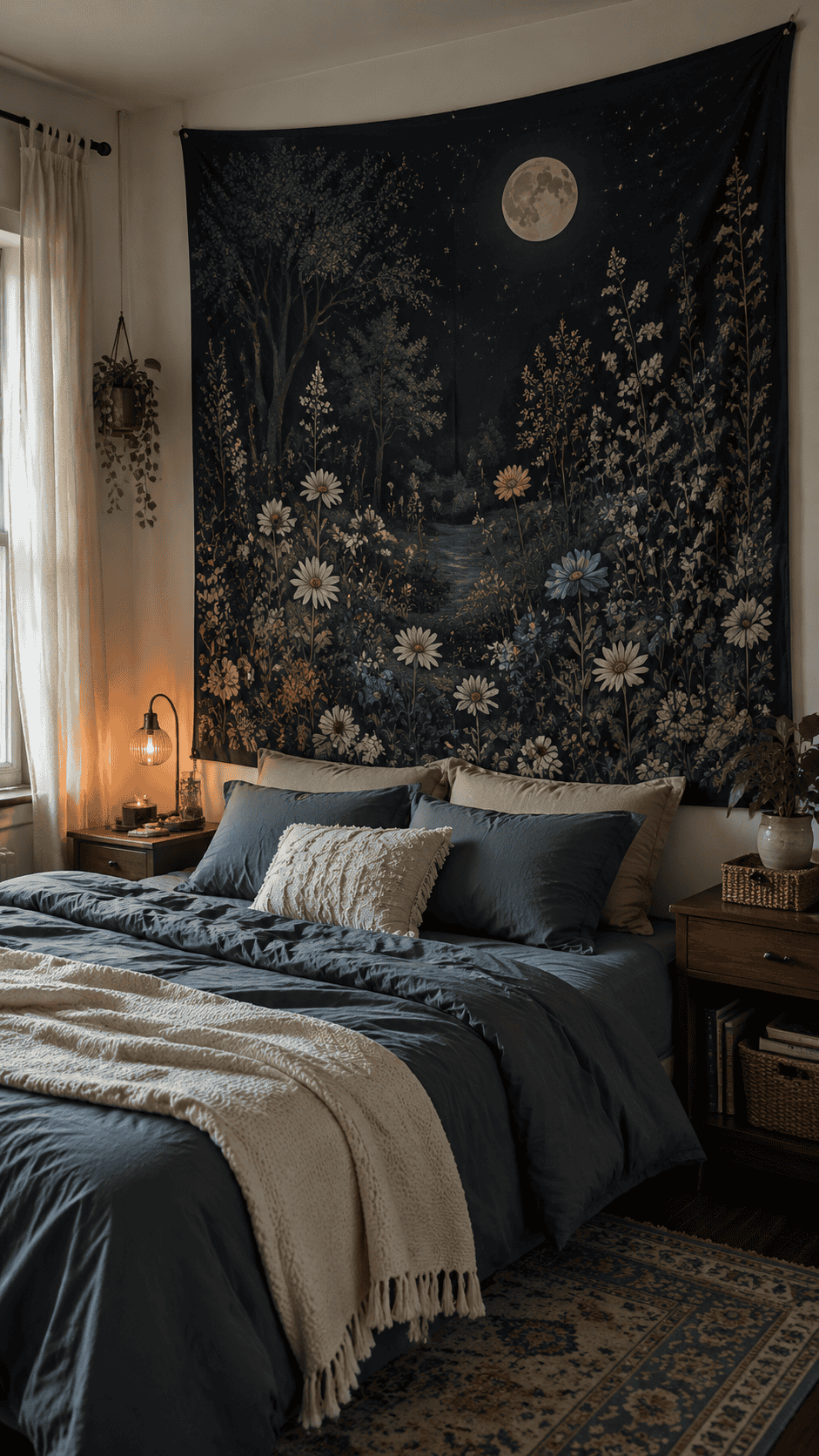
Tapestries don't get enough credit. They hang with minimal hardware - usually just a few tacks or a rod - which makes them ideal for renters who'd rather not commit to a grid of anchor bolts. They also absorb sound slightly, which is a quiet bonus in a sleep space. Hard walls bounce noise; fabric dampens it.
The Amhokhui Moonlit Garden Tapestry has a dark, celestial quality - deep indigo or near-black backgrounds with botanical and moon imagery worked through it. That combination is genuinely suited to a room designed for sleep. It also covers a large amount of wall for a fraction of what a similarly sized framed piece would cost, which matters when you're furnishing a bedroom on a real budget.
11. Three-Piece Boho Modern Canvas Set: Using Symmetry as a Shortcut
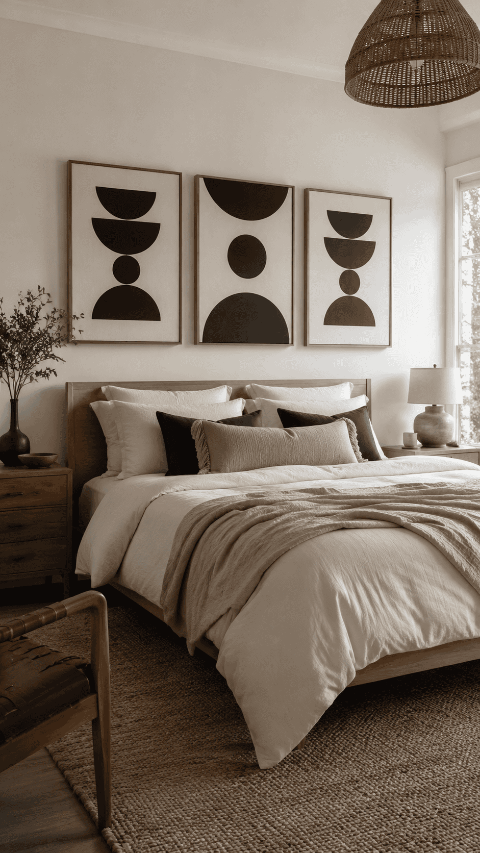
Symmetry is one of the fastest ways to make a bedroom feel put-together. It doesn't require much styling skill - it just requires matching. A set of three coordinated canvases hung in a row above the bed creates a rhythmic, organized look that most people read as "designed," even if the individual pieces are simple.
The Large Framed Boho Modern Neutral Abstract three-piece set uses black-and-white geometric forms that are versatile enough to work across Scandi-Boho, Modern Farmhouse, and even quieter Contemporary rooms. The neutrality is the point - it doesn't compete with bedding, doesn't clash with existing furniture, and doesn't date quickly.
12. Mkono Macrame Woven Wall Hangings for Narrower Spaces
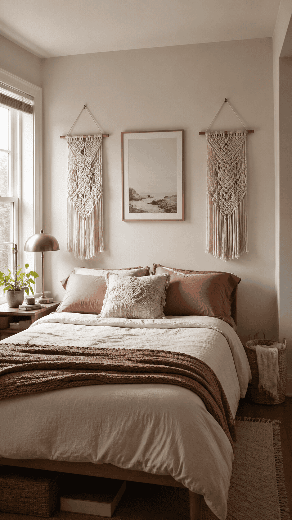
Not every bed has a sprawling horizontal wall above it. In a narrower room or above a twin or full bed, one massive piece can feel like it's trying too hard. A pair of smaller matching macrame hangings on either side of the center is a better-proportioned solution. It frames the space rather than filling it.
The Mkono pieces have that handmade, woven quality that makes a brand-new apartment feel slightly less like a showroom. There's something about visible craft - knotted fiber, irregular texture - that makes a space feel inhabited rather than assembled. It's a small thing, but it registers.
13. ANERZA French Country Prints for Traditional and Quiet Luxury Rooms
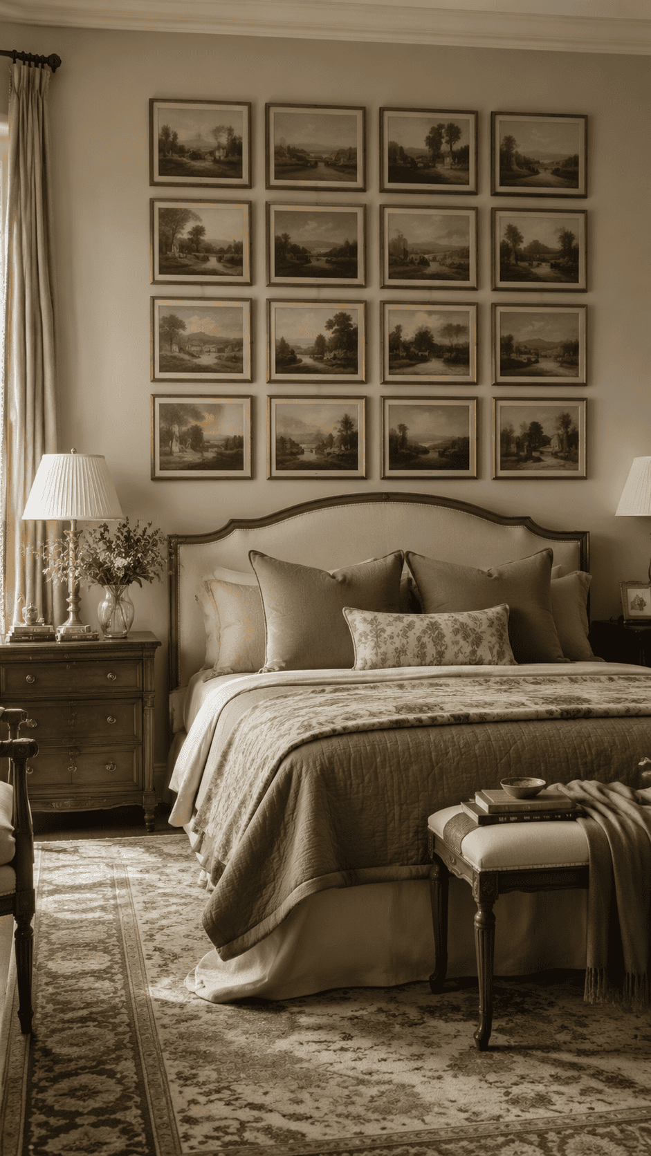
If your taste runs toward the traditional end - warm woods, layered textiles, nothing too angular - landscape prints with a vintage sensibility are the natural fit. The ANERZA 16-piece French Country set creates a large coordinated display that reads as high-end without requiring individual sourcing or color-matching across a dozen separate frames.
The muted, rustic tones in these landscapes are worth noting: soft greens, aged ochres, dusty blues. Those are genuinely restful colors for a sleep environment. The overall effect is unhurried, which is exactly the register Quiet Luxury aims for.
Did You Know
The two-thirds rule is one of the most reliable proportion guidelines in interior design: artwork or a grouped arrangement above a bed ideally spans about two-thirds to three-quarters of the headboard's width. Go narrower and the piece looks adrift. Go wider than the bed itself and the whole thing tips visually top-heavy.
A Few Things Worth Getting Right Before You Hang Anything
Height
The most common mistake is hanging art too high. Aim for the bottom edge of the piece to sit about 6 to 10 inches above the top of the headboard. Any higher and it starts to look like it floated away from the bed rather than belonging to it.
Width
Two-thirds to three-quarters of the bed's width is the practical target. A piece that's too small looks like a period in the middle of a blank page. A piece that overhangs the sides of the bed creates an unstable, top-heavy impression even when the wall can technically hold it.
Safety
If your home is in a seismic zone, anything with glass above the bed deserves proper wall anchors, not just picture hooks. Fiber pieces - macrame, tapestries, fabric hangings - are the lowest-risk options if that's a concern. They're also the easiest to rehang when you inevitably want to change things up.
The wooden sign that says Love isn't wrong, exactly. It just made the decision for you before you had a chance to figure out what you actually wanted the room to feel like. That wall above your bed is one of the more personal decisions in the whole house - it's worth five more minutes of thought than a default.